drawlib.diagrams.sequence
Chronological UML sequence diagrams with auto-spaced lifelines, participant groups, activation spans, sticky notes, and combined interaction blocks (alt, loop, opt, par). Canonical import: from drawlib.diagrams.sequence import GcpIcon, Participant, ParticipantGroup, PhosphorIcon, SequenceDiagram.
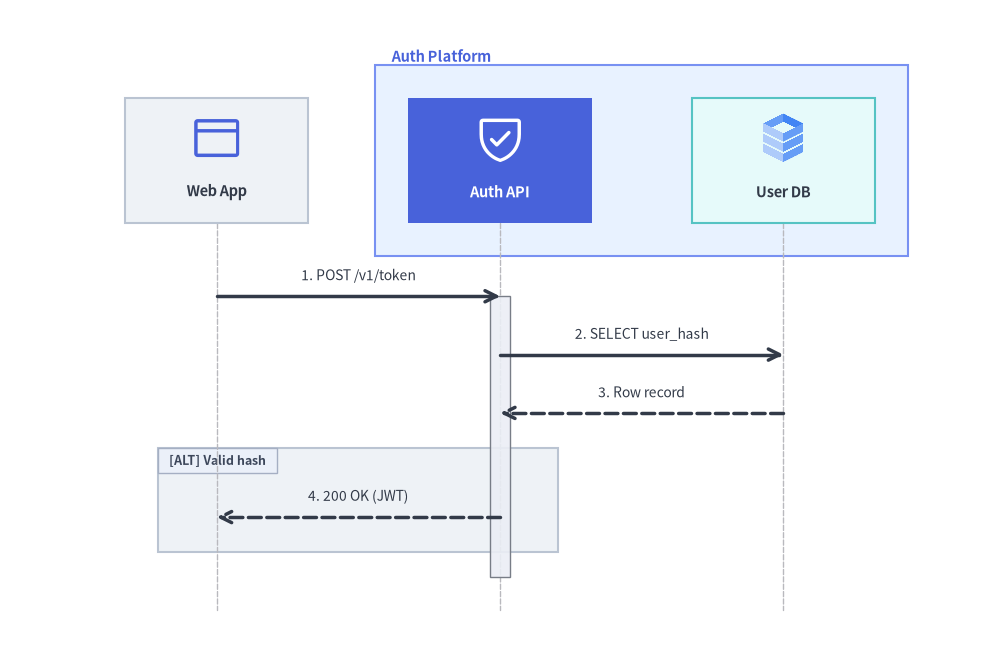
Token Verification Sequence with ParticipantGroup, Activation Span, and Alt Block
Source Code
from drawlib.canvas import save , setup
from drawlib.diagrams.sequence import GcpIcon , Participant , ParticipantGroup , PhosphorIcon , SequenceDiagram
from drawlib.styles import Colors , Styles
setup ( width = 120 , height = 78 )
d = SequenceDiagram (
node_style = Styles . Primary ,
node_text_style = Styles . DarkBold . patch ( text_size = 10.5 ),
edge_style = Styles . DarkBold ,
edge_text_style = Styles . Dark . patch ( text_size = 10.0 ),
node_card_style = Styles . Neutral ,
autonumber = True ,
col_width = 34.0 ,
step_y = 7.0 ,
margin = 4.0 ,
)
client = d . add ( Participant ( "Web App" , width = 22 , height = 15 , icon = PhosphorIcon . BROWSER , icon_size = 6.5 ))
platform = d . add (
ParticipantGroup (
title = "Auth Platform" ,
padding = 4.0 ,
style = Styles . PrimaryNeutral . patch ( line_style = "dashed" ),
text_style = Styles . PrimaryBold . patch ( text_size = 10.5 , halign = "left" ),
)
)
api = platform . add (
Participant (
"Auth API" ,
width = 22 ,
height = 15 ,
icon = PhosphorIcon . SHIELD_CHECK ,
icon_size = 6.5 ,
style = Styles . White ,
text_style = Styles . WhiteBold . patch ( text_color = Colors . White , text_size = 10.5 ),
card_style = Styles . PrimaryFlat ,
)
)
db = platform . add (
Participant ( "User DB" , width = 22 , height = 15 , icon = GcpIcon . CLOUD_SQL , icon_size = 6.5 , card_style = Styles . SecondaryNeutral )
)
api . activate ()
client . request ( api , "POST /v1/token" )
api . request ( db , "SELECT user_hash" )
db . reply ( api , "Row record" )
with d . alt ( "Valid hash" ) as blk :
blk . style = Styles . Neutral . patch ( line_style = "dashed" )
api . reply ( client , "200 OK (JWT)" )
api . deactivate ()
d . draw ( xy = ( 60.0 , 39.0 ), align = "center" )
save ()
class SequenceDiagram Top-level container and vertical timeline manager for sequence diagrams. Automatically spaces participants horizontally by col_width and advances time downward by step_y per event.
SequenceDiagram (
* ,
node_style : Style ,
node_text_style : Style ,
edge_style : Style ,
edge_text_style : Style ,
node_card_style : Style | None = None ,
title : str = "" ,
autonumber : bool = False ,
width : float | None = None ,
height : float | None = None ,
col_width : float = 20.0 ,
step_y : float = 7.0 ,
margin : float = 5.0 ,
style : Style | None = None ,
title_style : Style | None = None ,
) -> None
Coordinate Anchor : draw(xy=(0.0, 0.0), align="bottom_left") places the bottom-left corner of the sequence diagram at canvas coordinate xy (or centers the diagram bounding box at xy when align="center").
Constructor Parameters
Parameter
Type
Default
Description
node_styleStyle(Required) Base style for participant vector icons and fallback lifeline strokes (keyword-only).
node_text_styleStyle(Required) Base typography style for participant labels and group headers (keyword-only).
edge_styleStyle(Required) Base stroke and arrowhead style for message lines (keyword-only).
edge_text_styleStyle(Required) Base typography style for message labels, block headers, and notes (keyword-only).
node_card_styleStyle | NoneNoneOptional default background/border style for ParticipantNone renders transparent cards).
titlestr""Optional diagram title rendered centered above the top headers.
autonumberboolFalseWhen True, prefixes message labels sequentially (1., 2., 3., ...).
widthfloat | NoneNoneOptional fixed diagram width override in local units.
heightfloat | NoneNoneOptional fixed diagram height override in local units.
col_widthfloat20.0Default center-to-center horizontal spacing between auto-placed participants.
step_yfloat7.0Vertical distance advanced downward for each message, note, or block step.
marginfloat5.0Outer perimeter padding around participants and lifelines.
styleStyle | NoneNoneOptional outer background card style for the diagram container.
title_styleStyle | NoneNoneOptional typography style override for title.
Public Methods & Properties
Member
Kind
Signature
Description
addmethod(self, item: Participant | ParticipantGroup, x: float | None = None, *, show: bool | None = None) -> Participant | ParticipantGroupRegister a Participantx) or ParticipantGroup
altmethod(self, label: str = "", *, show: bool = True) -> BlockReturn an alt Blockwith d.alt("guard"):).
connectmethod(self, source: Participant, target: Participant, label: str = "", arrow: ArrowType = "->", is_async: bool = False, style: Style | None = None, text_style: Style | None = None, show: bool = True) -> MessageRecord a custom arrow Message"<->").
drawmethod(self, xy: tuple[float, float] = (0.0, 0.0), *, align: Literal["bottom_left", "center"] = "bottom_left", scale: PosFloat = 1.0) -> NoneRender the complete sequence diagram onto the active canvas.
else_method(self, label: str = "", *, show: bool = True) -> BlockInsert a dashed else divider branch inside an active alt block (or use as a context manager).
eventsproperty-> list[object]Return the recorded timeline event sequence in declaration order.
get_sizemethod(self) -> tuple[float, float]Estimate the total (width, height) of the diagram in unscaled local units.
groupsproperty-> list[ParticipantGroup]Return registered ParticipantGroup
loopmethod(self, label: str = "", *, show: bool = True) -> BlockReturn a loop Block
notemethod(self, text: str, on: Participant | None = None, over: list[Participant] | None = None, pos: NotePosition = "right", style: Style | None = None, show: bool = True) -> NoteRecord a Noteon or spanning across over participants at the current step.
optmethod(self, label: str = "", *, show: bool = True) -> BlockReturn an opt Block
parmethod(self, label: str = "", *, show: bool = True) -> BlockReturn a par Block
participantsproperty-> list[Participant]Return the ordered list of registered Participant
replymethod(self, source: Participant, target: Participant, label: str = "", is_async: bool = False, style: Style | None = None, text_style: Style | None = None, show: bool = True) -> MessageRecord a dashed return/response Messagesource to target.
requestmethod(self, source: Participant, target: Participant, label: str = "", is_async: bool = False, style: Style | None = None, text_style: Style | None = None, show: bool = True) -> MessageRecord a solid request Messagesource to target (supports self-calls when source is target).
spacemethod(self, dy: float = 5.0) -> NoneAdvance the vertical timeline by an extra dy units without drawing an event.
class Participant Actor, service, API endpoint, or database column in a sequence diagram with a top header card and a vertical dashed lifeline.
Participant (
text : str = "" ,
width : float = 20.0 ,
height : float = 16.0 ,
icon : IconType = None ,
icon_size : float = 8.0 ,
style : Style | None = None ,
text_style : Style | None = None ,
card_style : Style | None = None ,
lifeline_style : Style | None = None ,
show : bool = True ,
) -> None
Coordinate Anchor : Auto-spaced left-to-right along the top header row by diagram.col_width, or pinned horizontally at local x via d.add(p, x=...) / p.set_x(x).
Constructor Parameters
Parameter
Type
Default
Description
textstr""Display label inside the participant header card (supports \n).
widthfloat20.0Header card width in local units.
heightfloat16.0Header card height in local units.
iconIconTypeNoneAny of the 34 icon enums , icon callable, CustomIconDimagePIL.Image.Image, or image path.
icon_sizefloat8.0Rendered icon width/height in local units.
styleStyle | NoneNoneOptional vector icon style override (falls back to diagram.node_style).
text_styleStyle | NoneNoneOptional label typography style override (falls back to diagram.node_text_style).
card_styleStyle | NoneNoneOptional header card background/border style override (falls back to diagram.node_card_style).
lifeline_styleStyle | NoneNoneOptional stroke style override for the vertical dashed lifeline stem.
showboolTrueVisibility flag (False hides the participant, lifeline, and incident messages).
Public Methods & Properties
Member
Kind
Signature
Description
activatemethod(self) -> NoneBegin an active execution bar rectangle on this participant's lifeline at the current timeline step.
connectmethod(self, target: Participant, label: str = "", arrow: ArrowType = "->", is_async: bool = False, style: Style | None = None, text_style: Style | None = None, show: bool = True) -> MessageSend a custom arrow Messageself to target.
deactivatemethod(self) -> NoneClose the current active execution bar on this participant's lifeline.
get_header_sizemethod(self) -> tuple[float, float]Return (width, height) of the participant header card.
get_sizemethod(self) -> tuple[float, float]Alias returning (width, height) of the participant header card.
notemethod(self, text: str, pos: Literal["left", "right"] = "right", style: Style | None = None, show: bool = True) -> NoteAttach a Note"left" or "right" of this lifeline.
replymethod(self, target: Participant, label: str = "", is_async: bool = False, style: Style | None = None, text_style: Style | None = None, show: bool = True) -> MessageSend a dashed return/response Messageself to target.
requestmethod(self, target: Participant, label: str = "", is_async: bool = False, style: Style | None = None, text_style: Style | None = None, show: bool = True) -> MessageSend a solid request Messageself to target.
set_xmethod(self, x: float) -> ParticipantExplicitly pin this participant's horizontal lifeline coordinate to x and return self.
class ParticipantGroup Labeled boundary box enclosing a contiguous set of Participant
ParticipantGroup (
title : str = "" ,
padding : float = 4.0 ,
style : Style | None = None ,
text_style : Style | None = None ,
show : bool = True ,
) -> None
Coordinate Anchor : Automatically spans horizontally and vertically around the header cards of all member participants added via group.add(participant).
Constructor Parameters
Parameter
Type
Default
Description
titlestr""Group banner title rendered above the enclosed participant headers.
paddingfloat4.0Clearance padding around enclosed participant header cards.
styleStyle | NoneNoneOptional boundary box fill and stroke style.
text_styleStyle | NoneNoneOptional typography style override for title.
showboolTrueWhether to render the group boundary box and title.
Public Methods & Properties
Member
Kind
Signature
Description
addmethod(self, participant: Participant, *, show: bool | None = None) -> ParticipantAdd participant to this group (and register it on the parent SequenceDiagram if attached).
participantsproperty-> list[Participant]Return the ordered list of member Participant
class Message Recorded horizontal (or self-looping) interaction arrow between two Participantrequest(), reply(), and connect().
Message (
source : Participant ,
target : Participant ,
label : str = "" ,
is_reply : bool = False ,
is_async : bool = False ,
arrow : ArrowType = "->" ,
style : Style | None = None ,
text_style : Style | None = None ,
padding : PaddingType = 0.0 ,
show : bool = True ,
) -> None
Coordinate Anchor : Spans horizontally from source's lifeline X to target's lifeline X at the timeline Y position of its step (or loops to the right when source is target).
Constructor Parameters
Parameter
Type
Default
Description
sourceParticipant(Required) Sending participant.
targetParticipant(Required) Receiving participant (pass source for a recursive self-call loop).
labelstr""Message signature or payload description rendered above the arrow.
is_replyboolFalseWhen True, renders a dashed return line instead of a solid request line.
is_asyncboolFalseWhen True, renders an open stick arrowhead instead of a filled triangle.
arrowLiteral["->", "<-", "<->", "-"]"->"Arrowhead direction configuration.
styleStyle | NoneNoneOptional line stroke style override (falls back to diagram.edge_style).
text_styleStyle | NoneNoneOptional label typography style override (falls back to diagram.edge_text_style).
paddingfloat | tuple[float, float]0.0Clearance offset from the source/target lifelines.
showboolTrueWhether to render this message arrow and label.
Public Methods & Properties
Member
Kind
Signature
Description
is_self_callproperty-> boolTrue when source is target (rendered as a right-hand loopback arrow).
set_arrowmethod(self, arrow: ArrowType) -> MessageUpdate arrowhead marker and return self.
set_asyncmethod(self, is_async: bool = True) -> MessageToggle asynchronous open arrowhead styling and return self.
set_labelmethod(self, text: str) -> MessageUpdate message label text and return self.
set_paddingmethod(self, padding: PaddingType) -> MessageUpdate lifeline endpoint clearance padding and return self.
set_replymethod(self, is_reply: bool = True) -> MessageToggle dashed reply line rendering and return self.
set_stylemethod(self, style: Style) -> MessageOverride message line Styleself.
set_text_stylemethod(self, text_style: Style) -> MessageOverride message label Styleself.
class Block UML 2.0 combined interaction fragment (loop, alt, else, opt, par) used as a Python with context manager via d.loop(), d.alt(), d.else_(), d.opt(), and d.par().
Block (
block_type : BlockType ,
label : str = "" ,
diagram : SequenceDiagram | None = None ,
style : Style | None = None ,
text_style : Style | None = None ,
show : bool = True ,
) -> None
Coordinate Anchor : Automatically encloses the horizontal lifeline span and vertical timeline range of all messages recorded inside its with block.
Constructor Parameters & Mutable Attributes
Parameter
Type
Default
Description
block_typeLiteral["loop", "alt", "else", "opt", "par"](Required) Combined fragment operator badge displayed in the top-left pentagon tab.
labelstr""Guard condition or iteration expression rendered next to the operator badge.
diagramSequenceDiagram | NoneNoneOwning SequenceDiagram
styleStyle | NoneNoneFrame border and fill style (can be assigned inside with d.alt(...) as blk: blk.style = ...).
text_styleStyle | NoneNoneOperator tag and guard condition typography style.
showboolTrueWhether to render the block frame boundary and label tag.
class Note Sticky note annotation card attached beside a single Participant
Note (
text : str ,
on : Participant | None = None ,
over : list [ Participant ] | None = None ,
pos : NotePosition = "right" ,
style : Style | None = None ,
text_style : Style | None = None ,
show : bool = True ,
) -> None
Coordinate Anchor : Positioned at the current vertical timeline step to the "left" / "right" of on, or centered "over" the lifeline span of over.
Constructor Parameters
Parameter
Type
Default
Description
textstr(Required) Annotation text displayed inside the note card (supports \n).
onParticipant | NoneNoneTarget Participant
overlist[Participant] | NoneNoneList of participants to span across horizontally.
posLiteral["left", "right", "over"]"right"Placement relative to on ("left", "right", or "over").
styleStyle | NoneNoneOptional note card background and border style override.
text_styleStyle | NoneNoneOptional note text typography style override.
showboolTrueWhether to render this note card.
Public Methods & Properties
Member
Kind
Signature
Description
set_stylemethod(self, style: Style) -> NoteOverride note card background/border Styleself.
set_textmethod(self, text: str) -> NoteReplace note content text and return self.
set_text_stylemethod(self, text_style: Style) -> NoteOverride note text Styleself.
class CustomIcon Adapter wrapping raster image files, DimagePIL.Image.Image instances for use as Participant(..., icon=CustomIcon(...)).
CustomIcon (
image : str | Path | Dimage | Image | CustomIcon ,
) -> None
Coordinate Anchor : Centered automatically inside the Participanticon_size.
Constructor Parameters
Parameter
Type
Default
Description
imagestr | Path | Dimage | Image | CustomIcon(Required) Image file path, DimagePIL.Image.Image, or existing CustomIcon.
Public Methods & Properties
Member
Kind
Signature
Description
copymethod(self) -> CustomIconReturn an independent deep copy of this CustomIcon.
dimageproperty-> DimageReturn the underlying Dimage
type icons Re-exported icon namespace submodule (drawlib.diagrams.sequence.icons, shared with drawlib.diagrams.architecture.iconsCustomIconIconType, and all 34 diagram icon enums.
from drawlib.diagrams.sequence import icons
api = Participant ( "Gateway" , icon = icons . GcpIcon . CLOUD_ENDPOINTS )
Coordinate Anchor : Not applicable (namespace module re-exporting 40 icon types and helpers).
Export Group
Exported Symbols
Description
Icon Enums (34) icons.AiIcon .. icons.WorkspaceIconAll 34 StrEnum icon catalogs listed in Icon Enums (34 Suites)
Custom Wrapper icons.CustomIconAlias of CustomIcon
Type Aliases & Helpers icons.IconType, icons.draw_node_iconUnion type alias accepted by Participant(icon=...) and internal icon renderer helper.
enum Icon Enums (34 Suites) All 34 standardized icon StrEnum classes re-exported directly from drawlib.diagrams.sequence (and drawlib.diagrams.sequence.icons) for declarative Participant(..., icon=<Enum>.<MEMBER>) headers. PhosphorIcon glyphs are tinted by participant.style / diagram.node_style; the remaining 33 suites render PNG assets from drawlib.icons
Icon Enum
Corresponding drawlib.icons Suite
Category & Asset Style
AiIcondrawlib.icons.aiOfficial AI, LLM, and ML platform icons
AwsIcondrawlib.icons.awsOfficial Amazon Web Services architecture icons
AzureIcondrawlib.icons.azureOfficial Microsoft Azure architecture icons
BusinessIcondrawlib.icons.businessEnterprise SaaS, ERP, CRM, and FinTech brand icons
ClientIcondrawlib.icons.clientBrowsers, mobile/desktop OS, and client device icons
CloudIcondrawlib.icons.cloudCloud, PaaS, CDN, and hosting provider brand icons
CnativeIcondrawlib.icons.cnativeKubernetes and CNCF cloud-native ecosystem icons
CodeIcondrawlib.icons.codeProgramming languages, frameworks, and runtime icons
DataIcondrawlib.icons.dataRelational/NoSQL databases, caches, and streaming icons
DevopsIcondrawlib.icons.devopsCI/CD, IaC, containers, and observability tool icons
FacilityIcondrawlib.icons.facilityDatacenter, racks, telecom carriers, and hardware icons
GcpIcondrawlib.icons.gcpOfficial Google Cloud Platform architecture icons
ItserviceIcondrawlib.icons.itserviceIT service management, consulting, and enterprise vendor icons
NetworkIcondrawlib.icons.networkRouters, switches, firewalls, DNS, and network topology icons
OriginalAiIcondrawlib.icons.original_aiDrawlib vendor-neutral flat AI & ML icons
OriginalBusinessIcondrawlib.icons.original_businessDrawlib vendor-neutral flat business & office icons
OriginalClientIcondrawlib.icons.original_clientDrawlib vendor-neutral flat client & device icons
OriginalCloudIcondrawlib.icons.original_cloudDrawlib vendor-neutral flat cloud service icons
OriginalCnativeIcondrawlib.icons.original_cnativeDrawlib vendor-neutral flat cloud-native & container icons
OriginalCodeIcondrawlib.icons.original_codeDrawlib vendor-neutral flat code & SDK icons
OriginalDataIcondrawlib.icons.original_dataDrawlib vendor-neutral flat database & storage icons
OriginalDevopsIcondrawlib.icons.original_devopsDrawlib vendor-neutral flat DevOps & pipeline icons
OriginalFacilityIcondrawlib.icons.original_facilityDrawlib vendor-neutral flat building & facility icons
OriginalItserviceIcondrawlib.icons.original_itserviceDrawlib vendor-neutral flat IT operations & support icons
OriginalNetworkIcondrawlib.icons.original_networkDrawlib vendor-neutral flat network appliance icons
OriginalSecurityIcondrawlib.icons.original_securityDrawlib vendor-neutral flat security & IAM icons
OriginalServerIcondrawlib.icons.original_serverDrawlib vendor-neutral flat server & compute icons
OriginalSocialIcondrawlib.icons.original_socialDrawlib vendor-neutral flat social & messaging icons
OriginalWorkspaceIcondrawlib.icons.original_workspaceDrawlib vendor-neutral flat workspace & collaboration icons
PhosphorIcondrawlib.icons.phosphor1,530+ tintable monochrome Phosphor UI vector font icons
SecurityIcondrawlib.icons.securityOfficial cybersecurity, IAM, and compliance brand icons
ServerIcondrawlib.icons.serverLinux/Windows OS, hypervisors, and server hardware icons
SocialIcondrawlib.icons.socialSocial platforms, developer communities, and messaging icons
WorkspaceIcondrawlib.icons.workspaceProductivity suites, docs, and team collaboration SaaS icons