drawlib.smartarts (Lists, Cards & Tables)
High-level SmartArt components (from drawlib.smartarts import ...) for structured box lists, indented bullet lists, badged feature cards, titled container panels, KPI metric highlights, spanning matrix grids, syntax-highlighted vector source code, and 2D tables. For process flows, radial cycles, hierarchies, geographical maps, and calendars, see drawlib.smartarts (Flows, Trees & Maps) .
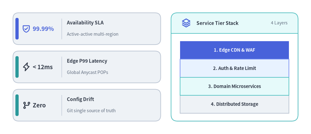
SmartArts Part 1 — KpiCards Stack & Panel-Framed BoxList
Source Code
from drawlib.canvas import save , setup
from drawlib.icons import phosphor
from drawlib.smartarts import BoxList , KpiCards , Panel
from drawlib.styles import Colors , Styles
setup ( width = 120 , height = 52 )
# Left: Vertical KpiCards Stack (Bottom-Left anchored at (5, 5))
kpi = KpiCards (
style = Styles . Neutral ,
metric_style = Styles . DarkBold . patch ( text_size = 13.5 ),
text_style = Styles . DarkBold . patch ( text_size = 11.0 ),
description_style = Styles . Muted . patch ( text_size = 10.0 ),
accent_style = Styles . SecondaryFlat ,
icon_style = Styles . PrimaryBold ,
accent_position = "left_pill" ,
metric_layout = "left_column" ,
metric_width_ratio = 0.33 ,
spacing = 2.5 ,
)
kpi . add (
"99.99%" ,
"Availability SLA" ,
"Active-active multi-region" ,
icon = phosphor . shield_check ,
metric_style = Styles . PrimaryBold . patch ( text_size = 13.5 ),
accent_style = Styles . PrimaryFlat ,
)
kpi . add (
"< 12ms" ,
"Edge P99 Latency" ,
"Global Anycast POPs" ,
icon = phosphor . lightning ,
icon_style = Styles . DarkBold ,
)
kpi . add (
"Zero" ,
"Config Drift" ,
"Git single source of truth" ,
icon = phosphor . git_branch ,
icon_style = Styles . DarkBold ,
)
kpi . draw ( xy = ( 5.0 , 5.0 ), width = 57.0 , height = 42.0 , columns = 1 , align = "bottom_left" )
# Right: Titled Panel Framing a Contiguous BoxList
panel = Panel (
"Service Tier Stack" ,
"4 Layers" ,
style = Styles . Neutral . patch ( shape_fill_color = Colors . White ),
header_style = Styles . SecondaryNeutral ,
text_style = Styles . DarkBold . patch ( text_size = 11.0 ),
description_style = Styles . Muted . patch ( text_size = 10.0 ),
icon = phosphor . stack ,
icon_style = Styles . PrimaryBold ,
header_variant = "filled" ,
header_height = 8.0 ,
)
panel . draw ( xy = ( 66.0 , 5.0 ), width = 49.0 , height = 42.0 , align = "bottom_left" )
inner_xy , inner_w , inner_h = panel . get_content_box (
xy = ( 66.0 , 5.0 ),
width = 49.0 ,
height = 42.0 ,
padding = ( 3.5 , 3.0 ),
align = "bottom_left" ,
)
tiers = BoxList (
style = Styles . Neutral ,
text_style = Styles . DarkBold . patch ( text_size = 10.5 ),
)
tiers . add (
"1. Edge CDN & WAF" ,
style = Styles . PrimaryFlat ,
text_style = Styles . WhiteBold . patch ( text_size = 10.5 ),
)
tiers . add ( "2. Auth & Rate Limit" , style = Styles . PrimaryNeutral )
tiers . add ( "3. Domain Microservices" , style = Styles . SecondaryNeutral )
tiers . add ( "4. Distributed Storage" , style = Styles . Neutral )
tiers . draw ( xy = inner_xy , box_width = inner_w , box_height = inner_h / 4.0 , direction = "top" )
save ()
class BoxList Draws a contiguous linear sequence of rectangular boxes with text in four directions ("left", "right", "bottom", "top"), automatically rendering custom-styled highlight items in a second pass so highlighted borders cleanly overlap adjacent default borders.
Coordinate Anchor: Bottom-Left (x, y) by default (align="bottom_left"), or Center (cx, cy) (align="center").
BoxList (
* ,
style : Style ,
text_style : Style ,
) -> None
Parameter
Type
Default
Description
styleStyleRequired Default rectangle fill and border style applied to boxes without per-item overrides.
text_styleStyleRequired Default text style applied to labels inside boxes without per-item overrides.
Methods & Properties
box_list . items -> list [ BoxListItem ]
box_list . add (
text : str ,
* ,
style : Style | None = None ,
text_style : Style | None = None ,
show : bool = True ,
) -> BoxListItem
box_list . draw (
xy : Coordinate ,
box_width : PosFloat ,
box_height : PosFloat ,
direction : Literal [ "left" , "right" , "bottom" , "top" ] = "left" ,
align : Literal [ "bottom_left" , "center" ] = "bottom_left" ,
scale : PosFloat = 1.0 ,
) -> Self
Member
Kind
Description
itemspropertyReturn the ordered list of registered BoxListItem instances (list[BoxListItem]).
add(text, *, style=None, text_style=None, show=True)methodAppend a box item with optional style and text_style overrides and return the created BoxListItem. Setting show=False hides the box while preserving sibling coordinates.
draw(xy, box_width, box_height, direction="left", align="bottom_left", scale=1.0)methodRender all visible boxes anchored at xy ("left" flows +x, "right" flows -x, "bottom" stacks +y, "top" stacks -y) with proportional scale, returning self.
class BoxListItem Mutable Pydantic item model representing a single box entry registered via BoxList.add(). Mutating attributes between BoxList.draw() calls updates the next rendered frame lazily without reconstructing the list.
Coordinate Anchor: Positioned automatically within the parent BoxList bounding box (align="bottom_left" or "center").
BoxListItem (
* ,
text : str ,
style : Style ,
text_style : Style ,
show : bool = True ,
) -> None
Attribute
Type
Default
Description
textstrRequired Label string centered inside the box.
styleStyleRequired Rectangle fill, border, and corner radius style for this box.
text_styleStyleRequired Font and color style for text.
showboolTrueVisibility toggle; when False, skips drawing this box while keeping all sibling box positions unchanged.
Methods & Properties
item . model_copy ( * , update : Mapping [ str , Any ] | None = None , deep : bool = False ) -> Self
item . model_dump ( * , mode : Literal [ "json" , "python" ] | str = "python" , ** kwargs : Any ) -> dict [ str , Any ]
BoxListItem . model_validate ( obj : Any , ** kwargs : Any ) -> BoxListItem
Member
Kind
Description
model_copy(*, update=None, deep=False)methodReturn a shallow or deep copy of the BoxListItem with optional field updates (inherited from pydantic.BaseModel).
model_dump(**kwargs) / model_dump_json(**kwargs)methodSerialize model fields to a Python dict or JSON string (along with model_validate, model_validate_json, model_json_schema, model_fields_set, and model_extra).
class BulletPoints Renders vertically spaced, multi-level bulleted lists with customizable per-level marker shapes or vector icons (circle, rectangle, drawlib.icons.phosphor.*). Level 0 draws unbulleted section headers by default, level 1 draws filled circular bullets, and level 2 draws open outline bullets.
Coordinate Anchor: Fixed Top-Left (x, y) — item 0 renders at y and subsequent items step downward (y - i * vertical_margin).
BulletPoints (
* ,
text_style : Style ,
vertical_margin : PosFloat ,
indent_width : PosFloat ,
) -> None
Parameter
Type
Default
Description
text_styleStyleRequired Default text style applied to bullet text and used to derive default level 1/2 marker colors.
vertical_marginPosFloatRequired Vertical row step in canvas units between consecutive bullet items (> 0).
indent_widthPosFloatRequired Horizontal indentation offset per level (x_text = x + indent_width * level, marker at level - 0.5).
Methods & Properties
bp . items -> list [ BulletPointItem ]
bp . set_indent ( level : int ) -> None
bp . set_bullet_style (
indent_level : int ,
function : Callable [ ... , Any ],
style : Style ,
args : dict [ str , Any ],
) -> None
bp . add (
text : str ,
* ,
text_style : Style | None = None ,
show : bool = True ,
) -> BulletPointItem
bp . draw (
xy : Coordinate ,
scale : PosFloat = 1.0 ,
) -> Self
Member
Kind
Description
itemspropertyReturn the ordered list of registered BulletPointItem models (list[BulletPointItem]).
set_indent(level)methodSet the active indentation level (0, 1, 2, ...) applied to subsequent add() calls.
set_bullet_style(indent_level, function, style, args)methodRegister a custom marker drawing callable (e.g. phosphor.check_circle), Style, and keyword args (e.g. {"width": 2.2}) for indent_level.
add(text, *, text_style=None, show=True)methodAppend a bullet item at the current indent level and return the created BulletPointItem.
draw(xy, scale=1.0)methodRender all visible bullet points starting from top-left xy with proportional scale, returning self.
class BulletPointItem Mutable Pydantic item model representing a single entry in BulletPoints. Exposes style as a read/write property alias for text_style for uniform animation styling.
Coordinate Anchor: Positioned at (x + indent_width * indent, y - index * vertical_margin) relative to BulletPoints.draw(xy).
BulletPointItem (
* ,
indent : int ,
text : str ,
text_style : Style ,
show : bool = True ,
) -> None
Attribute
Type
Default
Description
indentintRequired Indentation level (0, 1, 2, ...) captured when BulletPoints.add() was called.
textstrRequired Bullet point text content.
text_styleStyleRequired Text style applied when rendering this item.
showboolTrueVisibility toggle; when False, hides the marker and text while preserving the item's vertical line slot.
Methods & Properties
item . style -> Style
item . model_copy ( * , update : Mapping [ str , Any ] | None = None , deep : bool = False ) -> Self
Member
Kind
Description
stylepropertyRead/write alias for text_style (Style).
model_copy(*, update=None, deep=False)methodStandard Pydantic BaseModel copy/serialization suite (model_copy, model_dump, model_dump_json, model_validate, model_json_schema, model_fields_set, model_extra).
class CardList Renders vertical stacks (direction="vertical") or horizontal step sequences (direction="horizontal") of feature or workflow cards equipped with rounded-rectangle or circular badges, vector icons, short badge labels, multi-line descriptions, and optional inter-card "->" arrows.
Coordinate Anchor: Bottom-Left (x, y) by default (align="bottom_left"), or Center (cx, cy) (align="center").
CardList (
* ,
style : Style ,
text_style : Style ,
description_style : Style | None = None ,
badge_shape : Literal [ "circle" , "rounded_rect" , "none" ] = "rounded_rect" ,
badge_style : Style | None = None ,
badge_text_style : Style | None = None ,
icon_style : Style | None = None ,
direction : Literal [ "vertical" , "horizontal" ] = "vertical" ,
spacing : PosFloat = 2.5 ,
show_arrows : bool = False ,
arrow_style : Style | None = None ,
) -> None
Parameter
Type
Default
Description
styleStyleRequired Default card container fill, border, and corner radius style.
text_styleStyleRequired Default text style for primary card titles.
description_styleStyle | NoneNoneDefault text style for card descriptions (required if any card has a non-empty description without an item override).
badge_shapeLiteral["circle", "rounded_rect", "none"]"rounded_rect"Shape of the icon/label badge container ("none" renders icon/badge text without a background shape).
badge_styleStyle | NoneNoneDefault fill/border style for the badge shape (required when badge_shape != "none" and badge content is present).
badge_text_styleStyle | NoneNoneDefault text style for badge_text labels (required when badge_text is used).
icon_styleStyle | NoneNoneDefault style passed to icon callables (required when icon is used).
directionLiteral["vertical", "horizontal"]"vertical""vertical" stacks cards top-to-bottom; "horizontal" sequences cards left-to-right.
spacingPosFloat2.5Gap in canvas units between adjacent cards.
show_arrowsboolFalseWhen True, draws "->" connector arrows across spacing between adjacent visible cards.
arrow_styleStyle | NoneNoneLine style for inter-card arrows (required when show_arrows=True).
Methods & Properties
cl . items -> list [ CardListItem ]
cl . add (
text : str ,
description : str = "" ,
* ,
badge_text : str | None = None ,
icon : Callable [ ... , Any ] | None = None ,
style : Style | None = None ,
text_style : Style | None = None ,
description_style : Style | None = None ,
badge_style : Style | None = None ,
badge_text_style : Style | None = None ,
icon_style : Style | None = None ,
show : bool = True ,
) -> CardListItem
cl . draw (
xy : Coordinate ,
width : PosFloat = 90.0 ,
height : PosFloat = 50.0 ,
* ,
align : Literal [ "bottom_left" , "center" ] = "bottom_left" ,
scale : PosFloat = 1.0 ,
) -> Self
Member
Kind
Description
itemspropertyReturn the ordered list of registered CardListItem models (list[CardListItem]).
add(text, description="", *, badge_text=None, icon=None, ...)methodAppend a card item with optional badge label, icon callable, and per-card style overrides, returning CardListItem.
draw(xy, width=90.0, height=50.0, *, align="bottom_left", scale=1.0)methodRender the card list inside the (width, height) bounding box anchored at xy, returning self.
class CardListItem Mutable Pydantic item model for a single rich card in CardList. Supports simultaneous icon and badge_text rendering within the same badge as well as layout-preserving visibility toggling via show.
Coordinate Anchor: Positioned automatically within the parent CardList bounding box (align="bottom_left" or "center").
CardListItem (
* ,
text : str ,
description : str = "" ,
badge_text : str | None = None ,
icon : Callable [ ... , Any ] | None = None ,
style : Style ,
text_style : Style ,
description_style : Style | None = None ,
badge_style : Style | None = None ,
badge_text_style : Style | None = None ,
icon_style : Style | None = None ,
show : bool = True ,
) -> None
Attribute
Type
Default
Description
textstrRequired Primary card title text.
descriptionstr""Optional single-line or multi-line supporting description text.
badge_textstr | NoneNoneOptional short badge label (e.g. "1", "L1", "P0").
iconCallable[..., Any] | NoneNoneOptional icon drawing callable (e.g. phosphor.shield_check).
styleStyleRequired Card background rectangle style.
text_styleStyleRequired Text style for text.
description_styleStyle | NoneNoneOptional text style for description.
badge_styleStyle | NoneNoneOptional style for the badge background shape.
badge_text_styleStyle | NoneNoneOptional text style for badge_text.
icon_styleStyle | NoneNoneOptional style passed to icon.
showboolTrueWhether to render this card (and adjacent arrows) while preserving list layout geometry.
Methods & Properties
item . model_copy ( * , update : Mapping [ str , Any ] | None = None , deep : bool = False ) -> Self
item . model_dump ( * , mode : Literal [ "json" , "python" ] | str = "python" , ** kwargs : Any ) -> dict [ str , Any ]
Member
Kind
Description
model_copy(*, update=None, deep=False)methodReturn a copy of the card item model with optional field updates (pydantic.BaseModel).
model_dump(**kwargs) / model_validate(obj)methodStandard Pydantic serialization and validation methods (model_dump_json, model_validate_json, model_json_schema, model_fields_set, model_extra).
class Panel Renders a titled container frame with four header chrome variants ("filled", "underline", "floating", "window") and computes exact inner drawable coordinates via get_content_box() for nesting child SmartArts, Charts, or Diagrams.
Coordinate Anchor: Bottom-Left (x, y) by default (align="bottom_left"), or Center (cx, cy) (align="center").
Panel (
text : str ,
description : str = "" ,
* ,
style : Style ,
header_style : Style ,
text_style : Style ,
description_style : Style | None = None ,
icon : Callable [ ... , Any ] | None = None ,
icon_style : Style | None = None ,
dot_styles : tuple [ Style , Style , Style ] | Style | None = None ,
header_variant : Literal [ "filled" , "underline" , "floating" , "window" ] = "filled" ,
header_height : PosFloat = 8.0 ,
header_align : Literal [ "left" , "center" ] = "left" ,
show : bool = True ,
) -> None
Parameter
Type
Default
Description
textstrRequired Primary panel header title text.
descriptionstr""Optional right-aligned subtitle or tag in the header (description_style required when non-empty).
styleStyleRequired Outer panel body background and border style.
header_styleStyleRequired Style for the header band ("filled", "window"), divider line ("underline"), or pill badge ("floating").
text_styleStyleRequired Text style for the primary header title (text).
description_styleStyle | NoneNoneText style for description (raises ValueError if omitted when description is non-empty).
iconCallable[..., Any] | NoneNoneOptional icon callable rendered in the header.
icon_styleStyle | NoneNoneStyle passed to icon (raises ValueError if omitted when icon is set).
dot_stylestuple[Style, Style, Style] | Style | NoneNoneSingle Style or 3-tuple of window control dot styles (required when header_variant="window").
header_variantLiteral["filled", "underline", "floating", "window"]"filled"Visual layout mode of the panel header.
header_heightPosFloat8.0Height of the header band or floating pill in canvas units.
header_alignLiteral["left", "center"]"left"Horizontal alignment of the primary header title for "filled", "underline", and "window" variants.
showboolTrueWhether to render the panel when draw() is called.
Methods & Properties
panel . draw (
xy : Coordinate ,
width : PosFloat = 100.0 ,
height : PosFloat = 60.0 ,
* ,
align : Literal [ "bottom_left" , "center" ] = "bottom_left" ,
scale : PosFloat = 1.0 ,
) -> Self
panel . get_content_box (
xy : Coordinate ,
width : PosFloat = 100.0 ,
height : PosFloat = 60.0 ,
* ,
padding : PosFloat | tuple [ PosFloat , PosFloat ] = ( 4.0 , 3.0 ),
align : Literal [ "bottom_left" , "center" ] = "bottom_left" ,
content_align : Literal [ "bottom_left" , "center" ] | None = None ,
scale : PosFloat = 1.0 ,
) -> tuple [ tuple [ float , float ], float , float ]
Member
Kind
Description
draw(xy, width=100.0, height=60.0, *, align="bottom_left", scale=1.0)methodRender the panel container and header at xy, returning self.
get_content_box(xy, width=100.0, height=60.0, *, padding=(4.0, 3.0), align="bottom_left", content_align=None, scale=1.0)methodSubtract header_height and inset by padding (float or (pad_x, pad_y)), returning (inner_xy, inner_width, inner_height). inner_xy uses content_align (or align when None).
class KpiCards Renders KPI / metric highlight cards in vertical stacks (columns=1) or row-major multi-column grids (columns >= 2), pairing prominent metric callouts with titles, descriptions, optional icons, and left-pill or top-bar accents.
Coordinate Anchor: Bottom-Left (x, y) by default (align="bottom_left"), or Center (cx, cy) (align="center"). When columns > 1, cards populate row-major from top-left to bottom-right.
KpiCards (
* ,
style : Style ,
metric_style : Style ,
text_style : Style ,
description_style : Style | None = None ,
accent_style : Style | None = None ,
icon_style : Style | None = None ,
accent_position : Literal [ "left_pill" , "top_bar" , "none" ] = "left_pill" ,
metric_layout : Literal [ "left_column" , "top_stack" ] = "left_column" ,
metric_width_ratio : float = 0.28 ,
spacing : PosFloat = 3.0 ,
) -> None
Parameter
Type
Default
Description
styleStyleRequired Default card container fill and border style.
metric_styleStyleRequired Default text style for the large metric value (e.g. Styles.PrimaryBold.patch(text_size=18.0)).
text_styleStyleRequired Default text style for the card title.
description_styleStyle | NoneNoneDefault text style for supporting descriptions (required when description is non-empty).
accent_styleStyle | NoneNoneDefault style for the accent indicator (required when accent_position != "none").
icon_styleStyle | NoneNoneDefault style passed to icon callables (required when icon is provided).
accent_positionLiteral["left_pill", "top_bar", "none"]"left_pill"Placement of the decorative accent indicator inside each card.
metric_layoutLiteral["left_column", "top_stack"]"left_column""left_column" splits metric left and text right; "top_stack" stacks metric above centered title/description.
metric_width_ratiofloat0.28Fraction of card width (0.1–0.7) allocated to the metric column in "left_column" mode.
spacingPosFloat3.0Horizontal and vertical gap between cards in canvas units.
Methods & Properties
kpi . items -> list [ KpiCardItem ]
kpi . add (
metric : str ,
text : str ,
description : str = "" ,
* ,
style : Style | None = None ,
metric_style : Style | None = None ,
text_style : Style | None = None ,
description_style : Style | None = None ,
accent_style : Style | None = None ,
icon : Callable [ ... , Any ] | None = None ,
icon_style : Style | None = None ,
show : bool = True ,
) -> KpiCardItem
kpi . draw (
xy : Coordinate ,
width : PosFloat = 90.0 ,
height : PosFloat = 60.0 ,
* ,
columns : PosInt = 1 ,
align : Literal [ "bottom_left" , "center" ] = "bottom_left" ,
scale : PosFloat = 1.0 ,
) -> Self
Member
Kind
Description
itemspropertyReturn the ordered list of registered KpiCardItem instances (list[KpiCardItem]).
add(metric, text, description="", *, ...)methodAppend a KPI card with optional per-card style and icon overrides, returning KpiCardItem.
draw(xy, width=90.0, height=60.0, *, columns=1, align="bottom_left", scale=1.0)methodRender all visible KPI cards in columns columns inside (width, height) anchored at xy, returning self.
class KpiCard Singular class alias for KpiCards.items property, .add() method, and .draw() method. Provided for ergonomic imports when rendering single-card or multi-card KPI blocks.
Coordinate Anchor: Bottom-Left (x, y) by default (align="bottom_left"), or Center (cx, cy) (align="center").
KpiCard (
* ,
style : Style ,
metric_style : Style ,
text_style : Style ,
description_style : Style | None = None ,
accent_style : Style | None = None ,
icon_style : Style | None = None ,
accent_position : Literal [ "left_pill" , "top_bar" , "none" ] = "left_pill" ,
metric_layout : Literal [ "left_column" , "top_stack" ] = "left_column" ,
metric_width_ratio : float = 0.28 ,
spacing : PosFloat = 3.0 ,
) -> None
Parameter
Type
Default
Description
styleStyleRequired Default card container fill and border style.
metric_styleStyleRequired Default text style for the highlighted metric callout.
text_styleStyleRequired Default text style for the card title.
description_styleStyle | NoneNoneOptional text style for supporting card descriptions.
accent_styleStyle | NoneNoneOptional style for "left_pill" or "top_bar" accent indicators.
icon_styleStyle | NoneNoneOptional style passed to icon callables.
accent_positionLiteral["left_pill", "top_bar", "none"]"left_pill"Accent indicator placement mode.
metric_layoutLiteral["left_column", "top_stack"]"left_column"Internal card metric/text arrangement ("left_column" or "top_stack").
metric_width_ratiofloat0.28Left metric zone width ratio (0.1–0.7) when metric_layout="left_column".
spacingPosFloat3.0Gap between cards in canvas units.
Methods & Properties
card . items -> list [ KpiCardItem ]
card . add ( metric : str , text : str , description : str = "" , ** kwargs : Any ) -> KpiCardItem
card . draw ( xy : Coordinate , width : PosFloat = 90.0 , height : PosFloat = 60.0 , * , columns : PosInt = 1 , align : Literal [ "bottom_left" , "center" ] = "bottom_left" , scale : PosFloat = 1.0 ) -> Self
Member
Kind
Description
itemspropertyReturn the registered KpiCardItem list (list[KpiCardItem]).
add(metric, text, description="", *, ...)methodAppend a KPI card item and return KpiCardItem (identical to KpiCards.add).
draw(xy, width=90.0, height=60.0, *, columns=1, align="bottom_left", scale=1.0)methodRender the KPI card stack or grid at xy and return self (identical to KpiCards.draw).
class KpiCardItem Mutable Pydantic item model representing a single metric highlight card in KpiCards / KpiCard.
Coordinate Anchor: Positioned automatically within the parent KpiCards grid or stack.
KpiCardItem (
* ,
metric : str ,
text : str ,
description : str = "" ,
style : Style ,
metric_style : Style ,
text_style : Style ,
description_style : Style | None = None ,
accent_style : Style | None = None ,
icon : Callable [ ... , Any ] | None = None ,
icon_style : Style | None = None ,
show : bool = True ,
) -> None
Attribute
Type
Default
Description
metricstrRequired Primary highlighted metric value or callout string (e.g. "99.99%", "<50ms").
textstrRequired Primary card title text.
descriptionstr""Optional supporting description text.
styleStyleRequired Card background rectangle style.
metric_styleStyleRequired Text style for metric.
text_styleStyleRequired Text style for text.
description_styleStyle | NoneNoneOptional text style for description.
accent_styleStyle | NoneNoneOptional style for the card's left pill or top bar accent.
iconCallable[..., Any] | NoneNoneOptional icon drawing callable (e.g. from drawlib.icons.phosphor).
icon_styleStyle | NoneNoneOptional style passed to icon.
showboolTrueVisibility toggle; when False, skips rendering this card while preserving grid/stack geometry.
Methods & Properties
item . model_copy ( * , update : Mapping [ str , Any ] | None = None , deep : bool = False ) -> Self
item . model_dump ( * , mode : Literal [ "json" , "python" ] | str = "python" , ** kwargs : Any ) -> dict [ str , Any ]
Member
Kind
Description
model_copy(*, update=None, deep=False)methodReturn a copy of the KPI item model with optional field updates (pydantic.BaseModel).
model_dump(**kwargs) / model_validate(obj)methodStandard Pydantic serialization and validation methods (model_dump_json, model_validate_json, model_json_schema, model_fields_set, model_extra).
class GridLayout Positions rectangular cells across a num_column × num_row matrix supporting multi-column and multi-row cell spanning, optional outer container frames, and both uniform (draw) and custom per-track (draw_flexible) sizing.
Coordinate Anchor: Bottom-Left (x, y) by default (align="bottom_left"), or Center (cx, cy) (align="center"). Column 0 is on the left (+x rightward) and Row 0 is at the bottom (+y upward to num_row - 1 at the top).
GridLayout (
* ,
num_column : PosInt ,
num_row : PosInt ,
style : Style ,
text_style : Style ,
) -> None
Parameter
Type
Default
Description
num_columnPosIntRequired Total number of grid columns (>= 1).
num_rowPosIntRequired Total number of grid rows (>= 1; row 0 is bottom-most).
styleStyleRequired Default rectangle fill, border, and corner radius style for grid cells.
text_styleStyleRequired Default text style for cell labels.
Methods & Properties
grid . items -> list [ GridItem ]
grid . add (
position : tuple [ PosInt , PosInt ],
width : PosInt ,
height : PosInt ,
* ,
style : Style | None = None ,
text : str = "" ,
text_style : Style | None = None ,
show : bool = True ,
) -> GridItem
grid . draw (
xy : Coordinate ,
width : PosFloat ,
height : PosFloat ,
margin : PosFloat ,
outer_style : Style | None = None ,
align : Literal [ "bottom_left" , "center" ] = "bottom_left" ,
scale : PosFloat = 1.0 ,
) -> Self
grid . draw_flexible (
xy : Coordinate ,
column_widths : list [ PosFloat ],
column_margins : list [ PosFloat ],
row_heights : list [ PosFloat ],
row_margins : list [ PosFloat ],
outer_style : Style | None = None ,
align : Literal [ "bottom_left" , "center" ] = "bottom_left" ,
scale : PosFloat = 1.0 ,
) -> Self
Member
Kind
Description
itemspropertyReturn the ordered list of registered GridItem instances (list[GridItem]).
add(position, width, height, *, style=None, text="", text_style=None, show=True)methodRegister a cell starting at (column_start, row_start) spanning width columns and height rows, returning GridItem.
draw(xy, width, height, margin, outer_style=None, align="bottom_left", scale=1.0)methodRender uniform columns and rows with margin gutters (and perimeter frame when outer_style is provided), returning self.
draw_flexible(xy, column_widths, column_margins, row_heights, row_margins, outer_style=None, align="bottom_left", scale=1.0)methodRender using explicit column_widths (len num_column), column_margins (len num_column + 1), row_heights (len num_row), and row_margins (len num_row + 1), returning self.
class GridItem Mutable Pydantic item model storing cell position, column/row span, text, and style for GridLayout.
Coordinate Anchor: Spans columns position[0] .. position[0] + width - 1 and rows position[1] .. position[1] + height - 1 (0 = bottom-left cell) inside GridLayout.
GridItem (
* ,
position : tuple [ PosInt , PosInt ],
width : PosInt ,
height : PosInt ,
style : Style ,
text : str ,
text_style : Style ,
show : bool = True ,
) -> None
Attribute
Type
Default
Description
positiontuple[PosInt, PosInt]Required Zero-indexed (column_start, row_start) grid coordinate (row_start=0 is bottom-most).
widthPosIntRequired Number of columns spanned (>= 1).
heightPosIntRequired Number of rows spanned (>= 1).
styleStyleRequired Cell rectangle style.
textstrRequired Label string centered inside the cell.
text_styleStyleRequired Text style for text.
showboolTrueVisibility toggle; when False, hides the cell while keeping overall grid dimensions intact.
Methods & Properties
item . model_copy ( * , update : Mapping [ str , Any ] | None = None , deep : bool = False ) -> Self
item . model_dump ( * , mode : Literal [ "json" , "python" ] | str = "python" , ** kwargs : Any ) -> dict [ str , Any ]
Member
Kind
Description
model_copy(*, update=None, deep=False)methodReturn a copy of the grid item model with optional field updates (pydantic.BaseModel).
model_dump(**kwargs) / model_validate(obj)methodStandard Pydantic serialization and validation methods (model_dump_json, model_validate_json, model_json_schema, model_fields_set, model_extra).
class SourceCode Stateless class for rendering Pygments syntax-highlighted source code directly onto the canvas as crisp vector graphics. SourceCode cannot be instantiated (SourceCode() raises TypeError); call SourceCode.draw(...) (or the sourcecode()
Coordinate Anchor: Top-Left (x, y) by default (align="top_left"), or "bottom_left" / "center". Container height is computed automatically from line count and styles.default.text_size.
# Stateless class — do not instantiate (raises TypeError); invoke classmethods directly:
SourceCode . draw (
xy : Coordinate ,
width : PosFloat ,
code : str | None = None ,
* ,
styles : SourceCodeStyles ,
file : FilePath | None = None ,
code_lang : str | None = None ,
show_linenum : bool = False ,
align : Literal [ "top_left" , "bottom_left" , "center" ] = "top_left" ,
scale : PosFloat = 1.0 ,
) -> type [ Self ]
Parameter (SourceCode.draw)
Type
Default
Description
xyCoordinateRequired Anchor coordinate (x, y) of the code container (top-left by default).
widthPosFloatRequired Total container width in canvas units.
codestr | NoneNoneInline source code string to render (mutually exclusive with file).
stylesSourceCodeStylesRequired Token and container style configuration (from SourceCodeStyles.get() or get_source_code_styles()).
fileFilePath | NoneNonePath to an external source file to read and render (mutually exclusive with code).
code_langstr | NoneNoneLexer language name ("python", "yaml", "json", "sql", "bash", "go", "plain", etc.); auto-inferred when None.
show_linenumboolFalseWhen True, renders right-aligned line numbers in a left gutter.
alignLiteral["top_left", "bottom_left", "center"]"top_left"Anchor alignment of xy.
scalePosFloat1.0Proportional scale factor around xy.
Methods & Properties
SourceCode . draw (
xy : Coordinate ,
width : PosFloat ,
code : str | None = None ,
* ,
styles : SourceCodeStyles ,
file : FilePath | None = None ,
code_lang : str | None = None ,
show_linenum : bool = False ,
align : Literal [ "top_left" , "bottom_left" , "center" ] = "top_left" ,
scale : PosFloat = 1.0 ,
) -> type [ Self ]
SourceCode . get_text (
file : FilePath ,
strip : bool = True ,
) -> str
Member
Kind
Description
draw(xy, width, code=None, *, styles, file=None, code_lang=None, show_linenum=False, align="top_left", scale=1.0)classmethodTokenize and render syntax-highlighted source code onto the active canvas, returning SourceCode.
get_text(file, strip=True)staticmethodRead UTF-8 source text from file (resolved relative to the calling script when relative), optionally stripping leading/trailing whitespace.
class SourceCodeStyles Frozen Pydantic model holding the outer container style, line-number gutter style, and 8 lexical token styles used by SourceCode.draw() and sourcecode(). Use SourceCodeStyles.get() to load a preset theme ("default", "dark" / "monokai" / "github-dark", "google", "monochrome") with automatic CJK monospace font selection (font_lang="ja"), and .patch() to customize individual token styles or text_size.
Coordinate Anchor: Style configuration object (passed via styles=... to SourceCode.draw() or sourcecode()).
SourceCodeStyles (
* ,
box_style : Style ,
linenum_style : Style ,
default : Style ,
keyword : Style ,
string : Style ,
comment : Style ,
number : Style ,
function : Style ,
type_ : Style ,
operator : Style ,
) -> None
Attribute
Type
Default
Description
box_styleStyleRequired Fill, border, and corner radius style for the outer code card container.
linenum_styleStyleRequired Text style for gutter line numbers when show_linenum=True.
defaultStyleRequired Text style for unclassified identifiers and default code text.
keywordStyleRequired Text style for language keywords (def, class, return, if, import).
stringStyleRequired Text style for string and character literals.
commentStyleRequired Text style for single-line and block comments.
numberStyleRequired Text style for integer and floating-point literals.
functionStyleRequired Text style for function and method names.
type_StyleRequired Text style for class names, type annotations, and builtins.
operatorStyleRequired Text style for operators and punctuation tokens.
Methods & Properties
SourceCodeStyles . get (
styles : str = "default" ,
font_lang : str = "en" ,
* ,
font : FontSourceCode | FontFile | None = None ,
text_size : float = 12.0 ,
) -> SourceCodeStyles
code_styles . patch (
* ,
box_style : Style | None = None ,
linenum_style : Style | None = None ,
default : Style | None = None ,
keyword : Style | None = None ,
string : Style | None = None ,
comment : Style | None = None ,
number : Style | None = None ,
function : Style | None = None ,
type_ : Style | None = None ,
type : Style | None = None ,
operator : Style | None = None ,
text_size : float | None = None ,
) -> SourceCodeStyles
Member
Kind
Description
get(styles="default", font_lang="en", *, font=None, text_size=12.0)classmethodBuild a preset SourceCodeStyles for theme styles ("default", "dark", "monokai", "github-dark", "google", "monochrome") and language font_lang ("en" uses SourceCodePro; "ja"/"zh-cn"/"zh-tw"/"ko" uses SourceHanCodeJP).
patch(*, box_style=None, ..., type=None, text_size=None)methodReturn a new SourceCodeStyles with specified token/box styles replaced (type is a convenience alias for type_; text_size updates all 9 text/linenum styles simultaneously).
model_copy / model_dump / model_validatemethodStandard Pydantic v2 frozen BaseModel utilities.
def get_source_code_styles (styles='default', font_lang='en', *, font=None, text_size=12.0) Convenience function alias for SourceCodeStyles.get()SourceCodeStyles instance for the requested color theme and natural language font.
Coordinate Anchor: Returns a SourceCodeStyles configuration model (not a canvas drawing primitive).
get_source_code_styles (
styles : str = "default" ,
font_lang : str = "en" ,
* ,
font : FontSourceCode | FontFile | None = None ,
text_size : float = 12.0 ,
) -> SourceCodeStyles
Parameter
Type
Default
Description
stylesstr"default"Preset theme name ("default", "dark", "monokai", "github-dark", "google", "monochrome").
font_langstr"en"Language code ("en", "ja", "zh-cn", "zh-tw", "ko") used to select a CJK-safe monospace font when font=None.
fontFontSourceCode | FontFile | NoneNoneExplicit monospace font override; when None, resolved automatically from font_lang.
text_sizefloat12.0Base font size in points applied across all syntax token styles and line numbers (>= 10.0 recommended).
def sourcecode (xy, width, code=None, *, styles, file=None, code_lang=None, show_linenum=False, align='top_left', scale=1.0) Imperative function alias for SourceCode.draw()
Coordinate Anchor: Top-Left (x, y) by default (align="top_left"), or "bottom_left" / "center".
sourcecode (
xy : Coordinate ,
width : PosFloat ,
code : str | None = None ,
* ,
styles : SourceCodeStyles ,
file : FilePath | None = None ,
code_lang : str | None = None ,
show_linenum : bool = False ,
align : Literal [ "top_left" , "bottom_left" , "center" ] = "top_left" ,
scale : PosFloat = 1.0 ,
) -> None
Parameter
Type
Default
Description
xyCoordinateRequired Anchor coordinate (x, y) of the code container (interpreted via align).
widthPosFloatRequired Total width of the code container in canvas units.
codestr | NoneNoneSource code string to render (mutually exclusive with file).
stylesSourceCodeStylesRequired SourceCodeStyles instance defining box, gutter, and token styles.
fileFilePath | NoneNoneFile path containing source code to render (mutually exclusive with code).
code_langstr | NoneNoneProgramming language identifier (e.g. "python", "json", "yaml"); inferred when None.
show_linenumboolFalseWhether to display line numbers in a left gutter.
alignLiteral["top_left", "bottom_left", "center"]"top_left"Anchor alignment of xy.
scalePosFloat1.0Proportional scale factor around xy.
class Table Renders 2D tabular datasets (list[list[Any]]) with uniform (draw) or per-column/per-row (draw_flexible) dimensions and fine-grained styling rules for column headers, row headers, alternating even/odd rows, targeted cell ranges, and individual perimeter/inner border lines.
Coordinate Anchor: Top-Left (x, y) by default (align="top_left"), or "bottom_left" / "center". Row 0 starts at the top of the table and subsequent rows step downward (-y).
Table (
* ,
cell_style : Style ,
text_style : Style ,
header_cell_style : Style ,
header_text_style : Style ,
border_style : Style ,
has_header : bool = True ,
) -> None
Parameter
Type
Default
Description
cell_styleStyleRequired Default data cell style (uses cell_style.shape_fill_color for cell backgrounds).
text_styleStyleRequired Default text style for data cell values.
header_cell_styleStyleRequired Default header cell style applied to row 0 when has_header=True.
header_text_styleStyleRequired Default text style applied to row 0 contents when has_header=True.
border_styleStyleRequired Initial line style applied to all outer (top, bottom, left, right) and inner (between_columns, between_rows) borders.
has_headerboolTrueWhen True, initializes row 0 with header_cell_style and header_text_style.
Methods & Properties
table . draw (
xy : Coordinate ,
width : PosFloat ,
height : PosFloat ,
data : list [ list [ Any ]],
align : Literal [ "top_left" , "bottom_left" , "center" ] = "top_left" ,
scale : PosFloat = 1.0 ,
) -> Self
table . draw_flexible (
xy : Coordinate ,
column_widths : list [ PosFloat ],
row_heights : list [ PosFloat ],
data : list [ list [ Any ]],
align : Literal [ "top_left" , "bottom_left" , "center" ] = "top_left" ,
scale : PosFloat = 1.0 ,
) -> Self
table . reset_styles () -> None
table . set_style_border (
top : Style | None = None ,
top2 : Style | None = None ,
bottom : Style | None = None ,
left : Style | None = None ,
left2 : Style | None = None ,
right : Style | None = None ,
between_columns : Style | None = None ,
between_rows : Style | None = None ,
) -> None
table . set_style_cell (
background_color : ColorType ,
text_style : Style ,
rows : list [ PosInt ] | None = None ,
columns : list [ PosInt ] | None = None ,
) -> None
table . set_style_cell_evenodd (
even_color : ColorType ,
even_text_style : Style ,
odd_color : ColorType ,
odd_text_style : Style ,
) -> None
table . set_style_cell_header ( background_color : ColorType , text_style : Style ) -> None
table . set_style_cell_rowheader ( background_color : ColorType , text_style : Style ) -> None
table . set_style_cell_headers ( background_color : ColorType , text_style : Style ) -> None
Member
Kind
Description
draw(xy, width, height, data, align="top_left", scale=1.0)methodRender data (list[list[Any]]) with uniform column widths (width / cols) and row heights (height / rows), returning self.
draw_flexible(xy, column_widths, row_heights, data, align="top_left", scale=1.0)methodRender data with explicit per-column widths and per-row heights, returning self.
reset_styles()methodClear custom cell and border overrides and restore initial constructor settings.
set_style_border(top=None, top2=None, bottom=None, left=None, left2=None, right=None, between_columns=None, between_rows=None)methodReplace table border line styles (top2 is below row 0; left2 is right of col 0; pass None to hide specific grid lines).
set_style_cell(background_color, text_style, rows=None, columns=None)methodApply background_color and text_style to 0-indexed rows and/or columns (None matches all rows/columns).
set_style_cell_evenodd(even_color, even_text_style, odd_color, odd_text_style)methodApply alternating styles to even (0, 2, ...) and odd (1, 3, ...) rows. Call set_style_cell_header() after this method to keep row 0 styled as a header.
set_style_cell_header(background_color, text_style)methodApply background color and text style to the column header row (rows=[0]).
set_style_cell_rowheader(background_color, text_style)methodApply background color and text style to the row header column (columns=[0]).
set_style_cell_headers(background_color, text_style)methodApply background color and text style to both row 0 and column 0.