drawlib.smartarts(リスト・カード・KPI・テーブル)
from drawlib.smartarts import ... からインポートできる高水準 SmartArt コンポーネントのうち、ボックスリスト・箇条書き・バッジ付きカード・タイトル付きパネル・KPI カード・グリッドレイアウト・シンタックスハイライト付きソースコード・2次元テーブルを網羅します。プロセスフロー・サイクル・階層ツリー・地図・カレンダーについては drawlib.smartarts(フロー・ツリー・マップ・カレンダー) を参照してください。
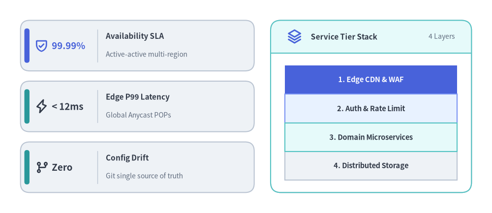
SmartArts パート1 — KpiCards スタックと Panel 内蔵 BoxList
Source Code
from drawlib.canvas import save , setup
from drawlib.icons import phosphor
from drawlib.smartarts import BoxList , KpiCards , Panel
from drawlib.styles import Colors , Styles
setup ( width = 120 , height = 52 )
# Left: Vertical KpiCards Stack (Bottom-Left anchored at (5, 5))
kpi = KpiCards (
style = Styles . Neutral ,
metric_style = Styles . DarkBold . patch ( text_size = 13.5 ),
text_style = Styles . DarkBold . patch ( text_size = 11.0 ),
description_style = Styles . Muted . patch ( text_size = 10.0 ),
accent_style = Styles . SecondaryFlat ,
icon_style = Styles . PrimaryBold ,
accent_position = "left_pill" ,
metric_layout = "left_column" ,
metric_width_ratio = 0.33 ,
spacing = 2.5 ,
)
kpi . add (
"99.99%" ,
"Availability SLA" ,
"Active-active multi-region" ,
icon = phosphor . shield_check ,
metric_style = Styles . PrimaryBold . patch ( text_size = 13.5 ),
accent_style = Styles . PrimaryFlat ,
)
kpi . add (
"< 12ms" ,
"Edge P99 Latency" ,
"Global Anycast POPs" ,
icon = phosphor . lightning ,
icon_style = Styles . DarkBold ,
)
kpi . add (
"Zero" ,
"Config Drift" ,
"Git single source of truth" ,
icon = phosphor . git_branch ,
icon_style = Styles . DarkBold ,
)
kpi . draw ( xy = ( 5.0 , 5.0 ), width = 57.0 , height = 42.0 , columns = 1 , align = "bottom_left" )
# Right: Titled Panel Framing a Contiguous BoxList
panel = Panel (
"Service Tier Stack" ,
"4 Layers" ,
style = Styles . Neutral . patch ( shape_fill_color = Colors . White ),
header_style = Styles . SecondaryNeutral ,
text_style = Styles . DarkBold . patch ( text_size = 11.0 ),
description_style = Styles . Muted . patch ( text_size = 10.0 ),
icon = phosphor . stack ,
icon_style = Styles . PrimaryBold ,
header_variant = "filled" ,
header_height = 8.0 ,
)
panel . draw ( xy = ( 66.0 , 5.0 ), width = 49.0 , height = 42.0 , align = "bottom_left" )
inner_xy , inner_w , inner_h = panel . get_content_box (
xy = ( 66.0 , 5.0 ),
width = 49.0 ,
height = 42.0 ,
padding = ( 3.5 , 3.0 ),
align = "bottom_left" ,
)
tiers = BoxList (
style = Styles . Neutral ,
text_style = Styles . DarkBold . patch ( text_size = 10.5 ),
)
tiers . add (
"1. Edge CDN & WAF" ,
style = Styles . PrimaryFlat ,
text_style = Styles . WhiteBold . patch ( text_size = 10.5 ),
)
tiers . add ( "2. Auth & Rate Limit" , style = Styles . PrimaryNeutral )
tiers . add ( "3. Domain Microservices" , style = Styles . SecondaryNeutral )
tiers . add ( "4. Distributed Storage" , style = Styles . Neutral )
tiers . draw ( xy = inner_xy , box_width = inner_w , box_height = inner_h / 4.0 , direction = "top" )
save ()
class BoxList テキスト入りの矩形ボックスを4方向("left", "right", "bottom", "top")に隙間なく連続配置する SmartArt コンポーネントです。カスタムスタイルが指定されたハイライト要素を自動的に第2パスで描画するため、強調枠線が隣接する標準ボックスの枠線より常に前面に重なります。
座標アンカー: デフォルトは 左下(Bottom-Left) (x, y)(align="bottom_left")、または 中央(Center) (cx, cy)(align="center")。
BoxList (
* ,
style : Style ,
text_style : Style ,
) -> None
パラメータ
型
デフォルト
説明
styleStyle必須 個別オーバーライドがないボックスに適用されるデフォルトの塗り・枠線スタイル。
text_styleStyle必須 個別オーバーライドがないボックス内ラベルに適用されるデフォルトのテキストスタイル。
メソッド・プロパティ
box_list . items -> list [ BoxListItem ]
box_list . add (
text : str ,
* ,
style : Style | None = None ,
text_style : Style | None = None ,
show : bool = True ,
) -> BoxListItem
box_list . draw (
xy : Coordinate ,
box_width : PosFloat ,
box_height : PosFloat ,
direction : Literal [ "left" , "right" , "bottom" , "top" ] = "left" ,
align : Literal [ "bottom_left" , "center" ] = "bottom_left" ,
scale : PosFloat = 1.0 ,
) -> Self
メンバ
種別
説明
itemsproperty登録済み BoxListItem の順序付きリスト(list[BoxListItem])を返します。
add(text, *, style=None, text_style=None, show=True)method任意の style・text_style オーバーライドを持つボックスを追加し、BoxListItem を返します。show=False にすると他のボックス座標を保ったまま非表示にします。
draw(xy, box_width, box_height, direction="left", align="bottom_left", scale=1.0)methodxy を基準に可視ボックスを描画します("left" は +x、"right" は -x、"bottom" は +y、"top" は -y 方向)。比例倍率 scale に対応し、self を返します。
class BoxListItem BoxList.add() で生成・登録される単一ボックス要素の可変 Pydantic モデルです。BoxList.draw() 呼び出しの間で属性を書き換えると、コンポーネントを再生成せずに次回描画へ遅延反映されます。
座標アンカー: 親 BoxList のバウンディングボックス内(align="bottom_left" または "center")に自動配置されます。
BoxListItem (
* ,
text : str ,
style : Style ,
text_style : Style ,
show : bool = True ,
) -> None
属性
型
デフォルト
説明
textstr必須 ボックス中央に表示されるラベル文字列。
styleStyle必須 ボックス矩形の塗り・枠線・角丸スタイル。
text_styleStyle必須 text に適用されるフォント・色スタイル。
showboolTrue表示フラグ。False の場合、他のボックスの配置座標を維持したまま描画をスキップします。
メソッド・プロパティ
item . model_copy ( * , update : Mapping [ str , Any ] | None = None , deep : bool = False ) -> Self
item . model_dump ( * , mode : Literal [ "json" , "python" ] | str = "python" , ** kwargs : Any ) -> dict [ str , Any ]
BoxListItem . model_validate ( obj : Any , ** kwargs : Any ) -> BoxListItem
メンバ
種別
説明
model_copy(*, update=None, deep=False)methodフィールド更新を指定して BoxListItem のコピーを生成します(pydantic.BaseModel 継承)。
model_dump(**kwargs) / model_dump_json(**kwargs)methodモデルの Python dict / JSON 変換および検証メソッド群(model_validate, model_validate_json, model_json_schema, model_fields_set, model_extra を含む)。
class BulletPoints インデント階層ごとにマーカー図形やベクターアイコン(circle, rectangle, drawlib.icons.phosphor.*)をカスタマイズできる箇条書きコンポーネントです。デフォルトではレベル 0 がマーカーなし見出し、レベル 1 が塗りつぶし円、レベル 2 が白抜き円マーカーとして描画されます。
座標アンカー: 左上固定(Top-Left) (x, y) — 先頭項目が y に描画され、以降の項目は下方向(y - i * vertical_margin)へ等間隔に並びます。
BulletPoints (
* ,
text_style : Style ,
vertical_margin : PosFloat ,
indent_width : PosFloat ,
) -> None
パラメータ
型
デフォルト
説明
text_styleStyle必須 箇条書きテキストのデフォルトスタイル(初期レベル 1/2 マーカーの色にも使用)。
vertical_marginPosFloat必須 各行の垂直送り幅(キャンバス単位、> 0)。
indent_widthPosFloat必須 1インデントあたりの水平オフセット幅(テキストは x + indent_width * level、マーカーは level - 0.5 の位置)。
メソッド・プロパティ
bp . items -> list [ BulletPointItem ]
bp . set_indent ( level : int ) -> None
bp . set_bullet_style (
indent_level : int ,
function : Callable [ ... , Any ],
style : Style ,
args : dict [ str , Any ],
) -> None
bp . add (
text : str ,
* ,
text_style : Style | None = None ,
show : bool = True ,
) -> BulletPointItem
bp . draw (
xy : Coordinate ,
scale : PosFloat = 1.0 ,
) -> Self
メンバ
種別
説明
itemsproperty登録済み BulletPointItem モデルのリスト(list[BulletPointItem])を返します。
set_indent(level)method以降の add() 呼び出しに適用される現在のインデントレベル(0, 1, 2, ...)を設定します。
set_bullet_style(indent_level, function, style, args)method指定した indent_level のマーカー描画関数(例: phosphor.check_circle)、Style、追加キーワード引数 args(例: {"width": 2.2})を設定します。
add(text, *, text_style=None, show=True)method現在のインデントレベルで箇条書き項目を追加し、BulletPointItem を返します。
draw(xy, scale=1.0)method左上座標 xy から可視状態の箇条書き項目を描画し、self を返します。
class BulletPointItem BulletPoints の単一行を表す可変 Pydantic モデルです。アニメーション等で他コンポーネントと統一的に扱えるよう、text_style の読み書きエイリアスとして style プロパティを提供します。
座標アンカー: BulletPoints.draw(xy) の起点から (x + indent_width * indent, y - index * vertical_margin) に配置されます。
BulletPointItem (
* ,
indent : int ,
text : str ,
text_style : Style ,
show : bool = True ,
) -> None
属性
型
デフォルト
説明
indentint必須 BulletPoints.add() 呼び出し時に記録されたインデントレベル(0, 1, 2, ...)。
textstr必須 箇条書きのテキスト文字列。
text_styleStyle必須 この項目の描画に用いるテキストスタイル。
showboolTrue表示フラグ。False にすると行送りの高さを維持したままマーカーとテキストを非表示にします。
メソッド・プロパティ
item . style -> Style
item . model_copy ( * , update : Mapping [ str , Any ] | None = None , deep : bool = False ) -> Self
メンバ
種別
説明
stylepropertytext_style の読み書きエイリアスプロパティ(Style)。
model_copy(*, update=None, deep=False)methodPydantic BaseModel 標準のコピー・直列化・検証メソッド群(model_copy, model_dump, model_dump_json, model_validate, model_json_schema, model_fields_set, model_extra)。
class CardList 角丸矩形または円形バッジ・ベクターアイコン・番号ラベル(badge_text)・複数行の説明文・カード間矢印(show_arrows=True)を備えたリッチなカード群を、縦積み(direction="vertical")または横並び(direction="horizontal")で描画します。
座標アンカー: デフォルトは 左下(Bottom-Left) (x, y)(align="bottom_left")、または 中央(Center) (cx, cy)(align="center")。
CardList (
* ,
style : Style ,
text_style : Style ,
description_style : Style | None = None ,
badge_shape : Literal [ "circle" , "rounded_rect" , "none" ] = "rounded_rect" ,
badge_style : Style | None = None ,
badge_text_style : Style | None = None ,
icon_style : Style | None = None ,
direction : Literal [ "vertical" , "horizontal" ] = "vertical" ,
spacing : PosFloat = 2.5 ,
show_arrows : bool = False ,
arrow_style : Style | None = None ,
) -> None
パラメータ
型
デフォルト
説明
styleStyle必須 カード外枠コンテナのデフォルト塗り・枠線・角丸スタイル。
text_styleStyle必須 カードタイトルのデフォルトテキストスタイル。
description_styleStyle | NoneNone説明文のデフォルトテキストスタイル(description を指定する場合は必須)。
badge_shapeLiteral["circle", "rounded_rect", "none"]"rounded_rect"バッジ背景の形状("none" の場合は背景図形なしでアイコン・ラベルのみ描画)。
badge_styleStyle | NoneNoneバッジ図形のデフォルトスタイル(badge_shape != "none" かつバッジ要素がある場合は必須)。
badge_text_styleStyle | NoneNonebadge_text のデフォルトテキストスタイル(badge_text 指定時は必須)。
icon_styleStyle | NoneNoneicon 関数へ渡すデフォルトスタイル(icon 指定時は必須)。
directionLiteral["vertical", "horizontal"]"vertical""vertical" は上から下へ縦積み、"horizontal" は左から右へ横並び配置。
spacingPosFloat2.5隣接カード間の余白幅(キャンバス単位)。
show_arrowsboolFalseTrue の場合、隣接する可視カード間に "->" 矢印を描画します。
arrow_styleStyle | NoneNoneカード間矢印の線スタイル(show_arrows=True の場合は必須)。
メソッド・プロパティ
cl . items -> list [ CardListItem ]
cl . add (
text : str ,
description : str = "" ,
* ,
badge_text : str | None = None ,
icon : Callable [ ... , Any ] | None = None ,
style : Style | None = None ,
text_style : Style | None = None ,
description_style : Style | None = None ,
badge_style : Style | None = None ,
badge_text_style : Style | None = None ,
icon_style : Style | None = None ,
show : bool = True ,
) -> CardListItem
cl . draw (
xy : Coordinate ,
width : PosFloat = 90.0 ,
height : PosFloat = 50.0 ,
* ,
align : Literal [ "bottom_left" , "center" ] = "bottom_left" ,
scale : PosFloat = 1.0 ,
) -> Self
メンバ
種別
説明
itemsproperty登録済み CardListItem モデルのリスト(list[CardListItem])を返します。
add(text, description="", *, badge_text=None, icon=None, ...)methodバッジ文字列・アイコン・個別スタイルオーバーライドを指定してカードを追加し、CardListItem を返します。
draw(xy, width=90.0, height=50.0, *, align="bottom_left", scale=1.0)methodxy を基準とする (width, height) 領域内にカードリストを描画し、self を返します。
class CardListItem CardList 内の単一カードを表す可変 Pydantic モデルです。同一バッジ内への icon と badge_text の同時描画や、レイアウト座標を保った show 切り替えに対応します。
座標アンカー: 親 CardList のバウンディングボックス内(align="bottom_left" または "center")に自動配置されます。
CardListItem (
* ,
text : str ,
description : str = "" ,
badge_text : str | None = None ,
icon : Callable [ ... , Any ] | None = None ,
style : Style ,
text_style : Style ,
description_style : Style | None = None ,
badge_style : Style | None = None ,
badge_text_style : Style | None = None ,
icon_style : Style | None = None ,
show : bool = True ,
) -> None
属性
型
デフォルト
説明
textstr必須 カードの主タイトル文字列。
descriptionstr""任意の補足説明テキスト(単一行・複数行対応)。
badge_textstr | NoneNone任意の短いバッジラベル(例: "1", "L1", "P0")。
iconCallable[..., Any] | NoneNone任意のアイコン描画関数(例: phosphor.shield_check)。
styleStyle必須 カード背景矩形のスタイル。
text_styleStyle必須 text のテキストスタイル。
description_styleStyle | NoneNonedescription のテキストスタイル。
badge_styleStyle | NoneNoneバッジ背景図形のスタイル。
badge_text_styleStyle | NoneNonebadge_text のテキストスタイル。
icon_styleStyle | NoneNoneicon に渡されるスタイル。
showboolTrue他のカード位置を保持したままこのカード(および隣接矢印)の表示・非表示を切り替えます。
メソッド・プロパティ
item . model_copy ( * , update : Mapping [ str , Any ] | None = None , deep : bool = False ) -> Self
item . model_dump ( * , mode : Literal [ "json" , "python" ] | str = "python" , ** kwargs : Any ) -> dict [ str , Any ]
メンバ
種別
説明
model_copy(*, update=None, deep=False)methodフィールド更新を伴うカードモデルの複製を返します(pydantic.BaseModel)。
model_dump(**kwargs) / model_validate(obj)methodPydantic 標準の直列化・検証メソッド群(model_dump_json, model_validate_json, model_json_schema, model_fields_set, model_extra)。
class Panel 4種類のヘッダー装飾バリアント("filled", "underline", "floating", "window")を持つタイトル付きコンテナ枠を描画します。get_content_box() によりヘッダーと内側パディングを除いた内部描画領域 (inner_xy, inner_width, inner_height) を自動計算でき、他の SmartArt・Chart・Diagram を綺麗にネストできます。
座標アンカー: デフォルトは 左下(Bottom-Left) (x, y)(align="bottom_left")、または 中央(Center) (cx, cy)(align="center")。
Panel (
text : str ,
description : str = "" ,
* ,
style : Style ,
header_style : Style ,
text_style : Style ,
description_style : Style | None = None ,
icon : Callable [ ... , Any ] | None = None ,
icon_style : Style | None = None ,
dot_styles : tuple [ Style , Style , Style ] | Style | None = None ,
header_variant : Literal [ "filled" , "underline" , "floating" , "window" ] = "filled" ,
header_height : PosFloat = 8.0 ,
header_align : Literal [ "left" , "center" ] = "left" ,
show : bool = True ,
) -> None
パラメータ
型
デフォルト
説明
textstr必須 パネルヘッダーの主タイトル文字列。
descriptionstr""ヘッダー右側に表示される任意のサブタイトル・タグ(非空の場合は description_style が必須)。
styleStyle必須 パネル外枠ボディの背景・枠線スタイル。
header_styleStyle必須 ヘッダー帯("filled", "window")、区切り線("underline")、またはピルバッジ("floating")のスタイル。
text_styleStyle必須 主タイトル(text)のテキストスタイル。
description_styleStyle | NoneNonedescription のテキストスタイル(description 指定時に省略すると ValueError)。
iconCallable[..., Any] | NoneNoneヘッダー内に描画する任意のアイコン関数。
icon_styleStyle | NoneNoneicon に渡すスタイル(icon 指定時に省略すると ValueError)。
dot_stylestuple[Style, Style, Style] | Style | NoneNoneウィンドウ左上3ドット用の単一 Style または3要素タプル(header_variant="window" 時は必須)。
header_variantLiteral["filled", "underline", "floating", "window"]"filled"パネルヘッダーの視覚バリアント。
header_heightPosFloat8.0ヘッダー帯またはフローティングピルの高さ(キャンバス単位)。
header_alignLiteral["left", "center"]"left""filled", "underline", "window" バリアントにおけるタイトルの水平揃え。
showboolTruedraw() 呼び出し時にパネルを描画するかどうか。
メソッド・プロパティ
panel . draw (
xy : Coordinate ,
width : PosFloat = 100.0 ,
height : PosFloat = 60.0 ,
* ,
align : Literal [ "bottom_left" , "center" ] = "bottom_left" ,
scale : PosFloat = 1.0 ,
) -> Self
panel . get_content_box (
xy : Coordinate ,
width : PosFloat = 100.0 ,
height : PosFloat = 60.0 ,
* ,
padding : PosFloat | tuple [ PosFloat , PosFloat ] = ( 4.0 , 3.0 ),
align : Literal [ "bottom_left" , "center" ] = "bottom_left" ,
content_align : Literal [ "bottom_left" , "center" ] | None = None ,
scale : PosFloat = 1.0 ,
) -> tuple [ tuple [ float , float ], float , float ]
メンバ
種別
説明
draw(xy, width=100.0, height=60.0, *, align="bottom_left", scale=1.0)method座標 xy にパネル本体とヘッダーを描画し、self を返します。
get_content_box(xy, width=100.0, height=60.0, *, padding=(4.0, 3.0), align="bottom_left", content_align=None, scale=1.0)method上部の header_height と四方の padding(単一 float または (pad_x, pad_y))を差し引いた内部領域 (inner_xy, inner_width, inner_height) を返します。
class KpiCards 主要な数値指標(SLA・レイテンシ・ベンチマーク値など)とタイトル・補足説明・アイコン・アクセントピル/トップバーを組み合わせた KPI カードを、縦スタック(columns=1)または複数列グリッド(columns >= 2)で描画します。
座標アンカー: デフォルトは 左下(Bottom-Left) (x, y)(align="bottom_left")、または 中央(Center) (cx, cy)(align="center")。columns > 1 の場合は上の行から下の行へ左から右(行優先)に配置されます。
KpiCards (
* ,
style : Style ,
metric_style : Style ,
text_style : Style ,
description_style : Style | None = None ,
accent_style : Style | None = None ,
icon_style : Style | None = None ,
accent_position : Literal [ "left_pill" , "top_bar" , "none" ] = "left_pill" ,
metric_layout : Literal [ "left_column" , "top_stack" ] = "left_column" ,
metric_width_ratio : float = 0.28 ,
spacing : PosFloat = 3.0 ,
) -> None
パラメータ
型
デフォルト
説明
styleStyle必須 カード外枠コンテナのデフォルト塗り・枠線スタイル。
metric_styleStyle必須 強調メトリクス文字列のデフォルトテキストスタイル(例: Styles.PrimaryBold.patch(text_size=18.0))。
text_styleStyle必須 カードタイトルのデフォルトテキストスタイル。
description_styleStyle | NoneNone補足説明のデフォルトテキストスタイル(description 指定時は必須)。
accent_styleStyle | NoneNoneアクセント装飾のデフォルトスタイル(accent_position != "none" 時は必須)。
icon_styleStyle | NoneNoneicon 関数へ渡すデフォルトスタイル(icon 指定時は必須)。
accent_positionLiteral["left_pill", "top_bar", "none"]"left_pill"カード内のアクセント装飾位置(左端ピル、上端バー、または非表示)。
metric_layoutLiteral["left_column", "top_stack"]"left_column""left_column" は左列に数値・右列に説明文を分割配置、"top_stack" は上段に数値・下段にタイトルを中央揃え配置。
metric_width_ratiofloat0.28"left_column" モードで左メトリクス列に割り当てるカード幅比率(0.1〜0.7)。
spacingPosFloat3.0カード間の水平・垂直ギャップ(キャンバス単位)。
メソッド・プロパティ
kpi . items -> list [ KpiCardItem ]
kpi . add (
metric : str ,
text : str ,
description : str = "" ,
* ,
style : Style | None = None ,
metric_style : Style | None = None ,
text_style : Style | None = None ,
description_style : Style | None = None ,
accent_style : Style | None = None ,
icon : Callable [ ... , Any ] | None = None ,
icon_style : Style | None = None ,
show : bool = True ,
) -> KpiCardItem
kpi . draw (
xy : Coordinate ,
width : PosFloat = 90.0 ,
height : PosFloat = 60.0 ,
* ,
columns : PosInt = 1 ,
align : Literal [ "bottom_left" , "center" ] = "bottom_left" ,
scale : PosFloat = 1.0 ,
) -> Self
メンバ
種別
説明
itemsproperty登録済み KpiCardItem インスタンスのリスト(list[KpiCardItem])を返します。
add(metric, text, description="", *, ...)method個別スタイルやアイコンを指定して KPI カードを追加し、KpiCardItem を返します。
draw(xy, width=90.0, height=60.0, *, columns=1, align="bottom_left", scale=1.0)methodxy を基準とする (width, height) 領域内に columns 列で KPI カード群を描画し、self を返します。
class KpiCard KpiCards.items プロパティ・.add()・.draw() を持つ単数形クラスエイリアスです。単一カードまたは複数カードの KPI ブロックを直感的な名前でインポートできます。
座標アンカー: デフォルトは 左下(Bottom-Left) (x, y)(align="bottom_left")、または 中央(Center) (cx, cy)(align="center")。
KpiCard (
* ,
style : Style ,
metric_style : Style ,
text_style : Style ,
description_style : Style | None = None ,
accent_style : Style | None = None ,
icon_style : Style | None = None ,
accent_position : Literal [ "left_pill" , "top_bar" , "none" ] = "left_pill" ,
metric_layout : Literal [ "left_column" , "top_stack" ] = "left_column" ,
metric_width_ratio : float = 0.28 ,
spacing : PosFloat = 3.0 ,
) -> None
パラメータ
型
デフォルト
説明
styleStyle必須 カードコンテナのデフォルト塗り・枠線スタイル。
metric_styleStyle必須 強調メトリクス値のデフォルトテキストスタイル。
text_styleStyle必須 カードタイトルのデフォルトテキストスタイル。
description_styleStyle | NoneNone補足説明のテキストスタイル。
accent_styleStyle | NoneNone"left_pill" または "top_bar" アクセントのスタイル。
icon_styleStyle | NoneNoneicon 関数へ渡すスタイル。
accent_positionLiteral["left_pill", "top_bar", "none"]"left_pill"アクセント装飾の配置モード。
metric_layoutLiteral["left_column", "top_stack"]"left_column"カード内部のメトリクス・テキスト配置モード。
metric_width_ratiofloat0.28metric_layout="left_column" 時の左列幅比率(0.1〜0.7)。
spacingPosFloat3.0カード間の余白幅(キャンバス単位)。
メソッド・プロパティ
card . items -> list [ KpiCardItem ]
card . add ( metric : str , text : str , description : str = "" , ** kwargs : Any ) -> KpiCardItem
card . draw ( xy : Coordinate , width : PosFloat = 90.0 , height : PosFloat = 60.0 , * , columns : PosInt = 1 , align : Literal [ "bottom_left" , "center" ] = "bottom_left" , scale : PosFloat = 1.0 ) -> Self
メンバ
種別
説明
itemsproperty登録済み KpiCardItem のリスト(list[KpiCardItem])を返します。
add(metric, text, description="", *, ...)methodKPI カード項目を追加して KpiCardItem を返します(KpiCards.add と同一)。
draw(xy, width=90.0, height=60.0, *, columns=1, align="bottom_left", scale=1.0)methodKPI カード群を xy に描画して self を返します(KpiCards.draw と同一)。
class KpiCardItem KpiCards / KpiCard 内の単一メトリクスカードを表す可変 Pydantic モデルです。
座標アンカー: 親 KpiCards のスタックまたはグリッド内に自動配置されます。
KpiCardItem (
* ,
metric : str ,
text : str ,
description : str = "" ,
style : Style ,
metric_style : Style ,
text_style : Style ,
description_style : Style | None = None ,
accent_style : Style | None = None ,
icon : Callable [ ... , Any ] | None = None ,
icon_style : Style | None = None ,
show : bool = True ,
) -> None
属性
型
デフォルト
説明
metricstr必須 強調表示する主要メトリクス値または短いコールアウト文字列(例: "99.99%", "<50ms")。
textstr必須 カードの主タイトル文字列。
descriptionstr""任意の補足説明テキスト。
styleStyle必須 カード背景矩形のスタイル。
metric_styleStyle必須 metric のテキストスタイル。
text_styleStyle必須 text のテキストスタイル。
description_styleStyle | NoneNonedescription のテキストスタイル。
accent_styleStyle | NoneNone左ピルまたは上部バーアクセントのスタイル。
iconCallable[..., Any] | NoneNone任意のアイコン描画関数(例: drawlib.icons.phosphor)。
icon_styleStyle | NoneNoneicon に渡されるスタイル。
showboolTrue表示フラグ。False の場合、グリッド/スタック座標を維持したまま描画をスキップします。
メソッド・プロパティ
item . model_copy ( * , update : Mapping [ str , Any ] | None = None , deep : bool = False ) -> Self
item . model_dump ( * , mode : Literal [ "json" , "python" ] | str = "python" , ** kwargs : Any ) -> dict [ str , Any ]
メンバ
種別
説明
model_copy(*, update=None, deep=False)methodフィールド更新を伴う KPI カードモデルの複製を返します(pydantic.BaseModel)。
model_dump(**kwargs) / model_validate(obj)methodPydantic 標準の直列化・検証メソッド群(model_dump_json, model_validate_json, model_json_schema, model_fields_set, model_extra)。
class GridLayout num_column × num_row マトリクス上に複数列・複数行結合(セルスパン)可能な矩形セルを配置するコンポーネントです。外枠フレーム描画(outer_style)や、均等分割(draw)と列幅・行高の個別指定(draw_flexible)の両方に対応します。
座標アンカー: デフォルトは 左下(Bottom-Left) (x, y)(align="bottom_left")、または 中央(Center) (cx, cy)(align="center")。列 0 が左端(右方向 +x)、行 0 が最下段 (上方向 +y に向かって num_row - 1 が最上段)となります。
GridLayout (
* ,
num_column : PosInt ,
num_row : PosInt ,
style : Style ,
text_style : Style ,
) -> None
パラメータ
型
デフォルト
説明
num_columnPosInt必須 グリッド全体の列数(>= 1)。
num_rowPosInt必須 グリッド全体の行数(>= 1、行 0 が最下段)。
styleStyle必須 セル矩形のデフォルト塗り・枠線・角丸スタイル。
text_styleStyle必須 セル内ラベルのデフォルトテキストスタイル。
メソッド・プロパティ
grid . items -> list [ GridItem ]
grid . add (
position : tuple [ PosInt , PosInt ],
width : PosInt ,
height : PosInt ,
* ,
style : Style | None = None ,
text : str = "" ,
text_style : Style | None = None ,
show : bool = True ,
) -> GridItem
grid . draw (
xy : Coordinate ,
width : PosFloat ,
height : PosFloat ,
margin : PosFloat ,
outer_style : Style | None = None ,
align : Literal [ "bottom_left" , "center" ] = "bottom_left" ,
scale : PosFloat = 1.0 ,
) -> Self
grid . draw_flexible (
xy : Coordinate ,
column_widths : list [ PosFloat ],
column_margins : list [ PosFloat ],
row_heights : list [ PosFloat ],
row_margins : list [ PosFloat ],
outer_style : Style | None = None ,
align : Literal [ "bottom_left" , "center" ] = "bottom_left" ,
scale : PosFloat = 1.0 ,
) -> Self
メンバ
種別
説明
itemsproperty登録済み GridItem インスタンスのリスト(list[GridItem])を返します。
add(position, width, height, *, style=None, text="", text_style=None, show=True)method起点 (column_start, row_start) から width 列 × height 行を結合するセルを登録し、GridItem を返します。
draw(xy, width, height, margin, outer_style=None, align="bottom_left", scale=1.0)methodセル間余白 margin(outer_style 指定時は外周余白も含む)で均等サイズのグリッドを描画し、self を返します。
draw_flexible(xy, column_widths, column_margins, row_heights, row_margins, outer_style=None, align="bottom_left", scale=1.0)methodcolumn_widths(長さ num_column)、column_margins(長さ num_column + 1)、row_heights(長さ num_row)、row_margins(長さ num_row + 1)を明示指定して描画し、self を返します。
class GridItem GridLayout の単一セルの位置・結合列数・結合行数・テキスト・スタイルを保持する可変 Pydantic モデルです。
座標アンカー: GridLayout 内で列 position[0] .. position[0] + width - 1、行 position[1] .. position[1] + height - 1(0 が左下セル)を占有します。
GridItem (
* ,
position : tuple [ PosInt , PosInt ],
width : PosInt ,
height : PosInt ,
style : Style ,
text : str ,
text_style : Style ,
show : bool = True ,
) -> None
属性
型
デフォルト
説明
positiontuple[PosInt, PosInt]必須 0始まりの (column_start, row_start) グリッド座標(row_start=0 が最下段)。
widthPosInt必須 結合する列数(>= 1)。
heightPosInt必須 結合する行数(>= 1)。
styleStyle必須 セル矩形のスタイル。
textstr必須 セル中央に描画されるテキスト文字列。
text_styleStyle必須 text のテキストスタイル。
showboolTrue表示フラグ。False の場合、グリッド全体の寸法を維持したままこのセルのみ非表示にします。
メソッド・プロパティ
item . model_copy ( * , update : Mapping [ str , Any ] | None = None , deep : bool = False ) -> Self
item . model_dump ( * , mode : Literal [ "json" , "python" ] | str = "python" , ** kwargs : Any ) -> dict [ str , Any ]
メンバ
種別
説明
model_copy(*, update=None, deep=False)methodフィールド更新を伴うグリッドセルモデルの複製を返します(pydantic.BaseModel)。
model_dump(**kwargs) / model_validate(obj)methodPydantic 標準の直列化・検証メソッド群(model_dump_json, model_validate_json, model_json_schema, model_fields_set, model_extra)。
class SourceCode Pygments 字句解析を用いてシンタックスハイライト付きソースコードをベクターグラフィックスとして直接描画するステートレスクラスです。インスタンス化は禁止されており(SourceCode() は TypeError を送出)、クラスメソッド SourceCode.draw(...) または関数エイリアス sourcecode()
座標アンカー: デフォルトは 左上(Top-Left) (x, y)(align="top_left")、または "bottom_left" / "center"。コンテナの高さはコード行数と styles.default.text_size から自動算出されます。
# Stateless class — do not instantiate (raises TypeError); invoke classmethods directly:
SourceCode . draw (
xy : Coordinate ,
width : PosFloat ,
code : str | None = None ,
* ,
styles : SourceCodeStyles ,
file : FilePath | None = None ,
code_lang : str | None = None ,
show_linenum : bool = False ,
align : Literal [ "top_left" , "bottom_left" , "center" ] = "top_left" ,
scale : PosFloat = 1.0 ,
) -> type [ Self ]
パラメータ(SourceCode.draw)
型
デフォルト
説明
xyCoordinate必須 コードコンテナのアンカー座標 (x, y)(デフォルトは左上)。
widthPosFloat必須 コードコンテナ全体の幅(キャンバス単位)。
codestr | NoneNone描画するソースコード文字列(file と排他指定)。
stylesSourceCodeStyles必須 トークン色・フォント・枠スタイル定義(SourceCodeStyles.get() または get_source_code_styles() で取得)。
fileFilePath | NoneNone読み込んで描画する外部ソースファイルのパス(code と排他指定)。
code_langstr | NoneNoneハイライト言語名("python", "yaml", "json", "sql", "bash", "go", "plain" 等)。None 時は自動推定。
show_linenumboolFalseTrue の場合、左ガターに右揃えの行番号を表示します。
alignLiteral["top_left", "bottom_left", "center"]"top_left"xy のアンカー位置解釈。
scalePosFloat1.0xy を基準とする比例スケーリング倍率。
メソッド・プロパティ
SourceCode . draw (
xy : Coordinate ,
width : PosFloat ,
code : str | None = None ,
* ,
styles : SourceCodeStyles ,
file : FilePath | None = None ,
code_lang : str | None = None ,
show_linenum : bool = False ,
align : Literal [ "top_left" , "bottom_left" , "center" ] = "top_left" ,
scale : PosFloat = 1.0 ,
) -> type [ Self ]
SourceCode . get_text (
file : FilePath ,
strip : bool = True ,
) -> str
メンバ
種別
説明
draw(xy, width, code=None, *, styles, file=None, code_lang=None, show_linenum=False, align="top_left", scale=1.0)classmethodシンタックスハイライト付きソースコードをキャンバスに描画し、SourceCode クラスを返します。
get_text(file, strip=True)staticmethodfile(相対パスは呼び出し元スクリプト基準で解決)から UTF-8 テキストを読み込みます。
class SourceCodeStyles SourceCode.draw() および sourcecode() で使用される外枠スタイル・行番号スタイル・8種類の構文トークンスタイルを保持する不変(frozen)Pydantic モデルです。SourceCodeStyles.get() でプリセットテーマ("default", "dark" / "monokai" / "github-dark", "google", "monochrome")と日本語対応等幅フォント(font_lang="ja")を取得し、.patch() で個別トークンや text_size を調整できます。
座標アンカー: スタイル設定モデル(SourceCode.draw() または sourcecode() の styles=... 引数に渡します)。
SourceCodeStyles (
* ,
box_style : Style ,
linenum_style : Style ,
default : Style ,
keyword : Style ,
string : Style ,
comment : Style ,
number : Style ,
function : Style ,
type_ : Style ,
operator : Style ,
) -> None
属性
型
デフォルト
説明
box_styleStyle必須 コードカード外枠の塗り・枠線・角丸スタイル。
linenum_styleStyle必須 show_linenum=True 時の左ガター行番号テキストスタイル。
defaultStyle必須 未分類識別子および標準コード文字のテキストスタイル。
keywordStyle必須 予約語・制御キーワード(def, class, return, if, import 等)のスタイル。
stringStyle必須 文字列リテラルのスタイル。
commentStyle必須 単一行・ブロックコメントのスタイル。
numberStyle必須 整数・浮動小数点リテラルのスタイル。
functionStyle必須 関数名・メソッド名のスタイル。
type_Style必須 クラス名・型注釈・組み込み型のスタイル。
operatorStyle必須 演算子・区切り記号トークンのスタイル。
メソッド・プロパティ
SourceCodeStyles . get (
styles : str = "default" ,
font_lang : str = "en" ,
* ,
font : FontSourceCode | FontFile | None = None ,
text_size : float = 12.0 ,
) -> SourceCodeStyles
code_styles . patch (
* ,
box_style : Style | None = None ,
linenum_style : Style | None = None ,
default : Style | None = None ,
keyword : Style | None = None ,
string : Style | None = None ,
comment : Style | None = None ,
number : Style | None = None ,
function : Style | None = None ,
type_ : Style | None = None ,
type : Style | None = None ,
operator : Style | None = None ,
text_size : float | None = None ,
) -> SourceCodeStyles
メンバ
種別
説明
get(styles="default", font_lang="en", *, font=None, text_size=12.0)classmethodテーマ名 styles("default", "dark", "monokai", "github-dark", "google", "monochrome")と言語 font_lang("en" は SourceCodePro、"ja"/"zh-cn"/"zh-tw"/"ko" は豆腐化を防ぐ SourceHanCodeJP)からプリセットを生成します。
patch(*, box_style=None, ..., type=None, text_size=None)method指定したトークン/枠スタイルを更新した新しい SourceCodeStyles を返します(type は type_ の別名、text_size は全9種のテキスト・行番号サイズを一括更新)。
model_copy / model_dump / model_validatemethodPydantic v2 不変 BaseModel の標準ユーティリティメソッド群。
def get_source_code_styles (styles='default', font_lang='en', *, font=None, text_size=12.0) SourceCodeStyles.get()SourceCodeStyles インスタンスを返します。
座標アンカー: SourceCodeStyles 設定モデルを返すヘルパー関数です(直接描画は行いません)。
get_source_code_styles (
styles : str = "default" ,
font_lang : str = "en" ,
* ,
font : FontSourceCode | FontFile | None = None ,
text_size : float = 12.0 ,
) -> SourceCodeStyles
パラメータ
型
デフォルト
説明
stylesstr"default"プリセットテーマ名("default", "dark", "monokai", "github-dark", "google", "monochrome")。
font_langstr"en"font=None 時に等幅フォントを自動選択する言語コード("en", "ja", "zh-cn", "zh-tw", "ko")。
fontFontSourceCode | FontFile | NoneNone明示的な等幅フォント指定(None 時は font_lang から解決)。
text_sizefloat12.0全トークンおよび行番号に適用される基本フォントサイズ(10.0 以上を推奨)。
def sourcecode (xy, width, code=None, *, styles, file=None, code_lang=None, show_linenum=False, align='top_left', scale=1.0) SourceCode.draw()
座標アンカー: デフォルトは 左上(Top-Left) (x, y)(align="top_left")、または "bottom_left" / "center"。
sourcecode (
xy : Coordinate ,
width : PosFloat ,
code : str | None = None ,
* ,
styles : SourceCodeStyles ,
file : FilePath | None = None ,
code_lang : str | None = None ,
show_linenum : bool = False ,
align : Literal [ "top_left" , "bottom_left" , "center" ] = "top_left" ,
scale : PosFloat = 1.0 ,
) -> None
パラメータ
型
デフォルト
説明
xyCoordinate必須 コードコンテナのアンカー座標 (x, y)(align に従って解釈)。
widthPosFloat必須 コードコンテナ全体の幅(キャンバス単位)。
codestr | NoneNone描画するソースコード文字列(file と排他指定)。
stylesSourceCodeStyles必須 外枠・行番号・構文トークン色を定義する SourceCodeStyles インスタンス。
fileFilePath | NoneNoneソースコードを読み込むファイルパス(code と排他指定)。
code_langstr | NoneNoneプログラミング言語識別子(例: "python", "json", "yaml")。None 時は自動判定。
show_linenumboolFalse左ガターに行番号を表示するかどうか。
alignLiteral["top_left", "bottom_left", "center"]"top_left"xy のアンカー位置揃え。
scalePosFloat1.0xy を基準とする比例スケーリング倍率。
class Table 2次元リスト(list[list[Any]])の表データを、均等セル(draw)または列幅・行高の個別指定(draw_flexible)で描画するクラスです。列ヘッダー・行ヘッダー・偶数/奇数ストライプ・特定セル範囲の背景色やテキストスタイル、さらに外周・内部罫線の個別スタイル制御に対応します。
座標アンカー: デフォルトは 左上(Top-Left) (x, y)(align="top_left")、または "bottom_left" / "center"。row 0 がテーブル上端に配置され、以降の行は下方向(-y)へ並びます。
Table (
* ,
cell_style : Style ,
text_style : Style ,
header_cell_style : Style ,
header_text_style : Style ,
border_style : Style ,
has_header : bool = True ,
) -> None
パラメータ
型
デフォルト
説明
cell_styleStyle必須 データセルのデフォルトスタイル(cell_style.shape_fill_color をセル背景色に使用)。
text_styleStyle必須 データセル文字列のデフォルトテキストスタイル。
header_cell_styleStyle必須 has_header=True 時に先頭行(row 0)へ適用されるヘッダーセルスタイル。
header_text_styleStyle必須 has_header=True 時に先頭行(row 0)へ適用されるヘッダーテキストスタイル。
border_styleStyle必須 初期化時に外周(top, bottom, left, right)および内部罫線(between_columns, between_rows)へ一括設定される線スタイル。
has_headerboolTrueTrue の場合、row 0 を header_cell_style / header_text_style で初期化します。
メソッド・プロパティ
table . draw (
xy : Coordinate ,
width : PosFloat ,
height : PosFloat ,
data : list [ list [ Any ]],
align : Literal [ "top_left" , "bottom_left" , "center" ] = "top_left" ,
scale : PosFloat = 1.0 ,
) -> Self
table . draw_flexible (
xy : Coordinate ,
column_widths : list [ PosFloat ],
row_heights : list [ PosFloat ],
data : list [ list [ Any ]],
align : Literal [ "top_left" , "bottom_left" , "center" ] = "top_left" ,
scale : PosFloat = 1.0 ,
) -> Self
table . reset_styles () -> None
table . set_style_border (
top : Style | None = None ,
top2 : Style | None = None ,
bottom : Style | None = None ,
left : Style | None = None ,
left2 : Style | None = None ,
right : Style | None = None ,
between_columns : Style | None = None ,
between_rows : Style | None = None ,
) -> None
table . set_style_cell (
background_color : ColorType ,
text_style : Style ,
rows : list [ PosInt ] | None = None ,
columns : list [ PosInt ] | None = None ,
) -> None
table . set_style_cell_evenodd (
even_color : ColorType ,
even_text_style : Style ,
odd_color : ColorType ,
odd_text_style : Style ,
) -> None
table . set_style_cell_header ( background_color : ColorType , text_style : Style ) -> None
table . set_style_cell_rowheader ( background_color : ColorType , text_style : Style ) -> None
table . set_style_cell_headers ( background_color : ColorType , text_style : Style ) -> None
メンバ
種別
説明
draw(xy, width, height, data, align="top_left", scale=1.0)method均等列幅(width / cols)・均等行高(height / rows)で2次元データ data を描画し、self を返します。
draw_flexible(xy, column_widths, row_heights, data, align="top_left", scale=1.0)method列ごとの幅リスト column_widths と行ごとの高さリスト row_heights を明示指定して data を描画し、self を返します。
reset_styles()methodセルおよび罫線のカスタム設定をリセットし、コンストラクタ初期状態へ戻します。
set_style_border(top=None, top2=None, bottom=None, left=None, left2=None, right=None, between_columns=None, between_rows=None)method各罫線の線スタイルを再設定します(top2 は row 0 直下、left2 は col 0 右隣、None 指定箇所は非表示)。
set_style_cell(background_color, text_style, rows=None, columns=None)method0始まりの rows/columns 範囲に背景色とテキストスタイルを適用します(None は全行/全列対象)。
set_style_cell_evenodd(even_color, even_text_style, odd_color, odd_text_style)method偶数行(0, 2, ...)と奇数行(1, 3, ...)に交互スタイルを適用します。先頭行のヘッダー色を保つ場合は本メソッドの後 に set_style_cell_header() を呼び出してください。
set_style_cell_header(background_color, text_style)method列ヘッダー行(rows=[0])に背景色とテキストスタイルを適用します。
set_style_cell_rowheader(background_color, text_style)method行ヘッダー列(columns=[0])に背景色とテキストスタイルを適用します。
set_style_cell_headers(background_color, text_style)method列ヘッダー(row 0)と行ヘッダー(column 0)の両方に背景色とテキストスタイルを適用します。